Levi Strauss
Legendary fashion brand goes high-tech with responsive eCommerce.
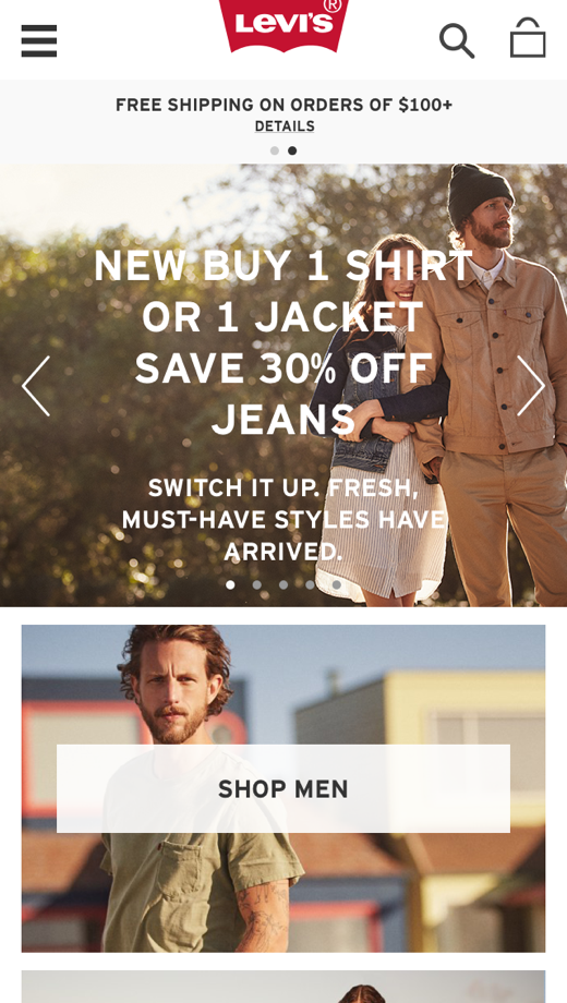
The Levi’s eCommerce experience evolved just like most others: what started as a single web-based experience many years ago had grown to support a mobile site, native phone apps, and even custom experiences for tablets. As new technology and trends emerged, Levi’s was at the forefront of providing their loyal customers with the right experience on the right device. But just like many other retailers, the disparate array of platforms, technologies, and designs eventually became too much to manage. Now, the landscape has changed. It’s possible to build a responsive eCommerce solution that works the same across all devices with one codebase (even native apps!) and that prospect is too effective to ignore.



Based on our experience building a responsive platform for Sam’s Club and Walmart, the team at Levi’s knew we were the perfect fit to take their customer experience to the next level with a new UI and more performant technology stack. In fact, not only could we deliver on a single codebase for the Levi’s brand - we also proposed building a single system to use across both Levi’s and Docker’s brands with nothing more than a simple configuration change.
One codebase. Every device. Web and native. Two different brands. Sound appealing? The team at Levi’s thought so too, so we got to work.
Open Source Values
At Bitovi, our business is built on open source. On every project, we utilize the latest in JavaScript technology to ensure that everything we build is taking advantage of best practices and ready for prime time. More than that, we build and maintain some of the most powerful open source frameworks for building web applications - so we can ensure quality and guarantee support to our clients.
Despite being a retail brand, Levi’s is equally committed to open source and fostering a sense of community among their team in San Francisco. To that end, they wanted to capitalize on the popularity of React to build a new web application that everyone could really rally around and our expertise in open source JavaScript fit perfectly with their values on this project.


There’s no doubt React is changing the way people create web applications, but out of the box it doesn’t provide everything you need to deploy a large-scale eCommerce app. That’s where our own framework, DoneJS, comes in. While DoneJS was built to provide everything you need for a modern app, it uses CanJS for the view model by default. For a best-of-both-worlds application, we flexed our open source muscles to create a DoneJS-React bridge that would swap out CanJS with the React view model for React-style performance and DoneJS-style ease of use. The result was an application built to be support by the community, but with the backing and guarantee of open source success that only Bitovi can provide.
“We build and maintain some of the most powerful open source frameworks for building web applications - so we can ensure quality and guarantee support to our clients.“
The Proof is in the Partnership
To kick things off, our team engaged in a short discovery phase to prove the viability of our design process, as well as our technical solutions. A discovery phase is a low-risk, short engagement for both teams to work together, solve for some of the major unknowns, and make sure we have a clear path to success. We frequently start new projects this way to ensure a good team fit, to help estimate the effort required, and make sure any assumptions about new technology are going to work. At the end, we present our findings to stakeholders and outline a plan for moving forward.
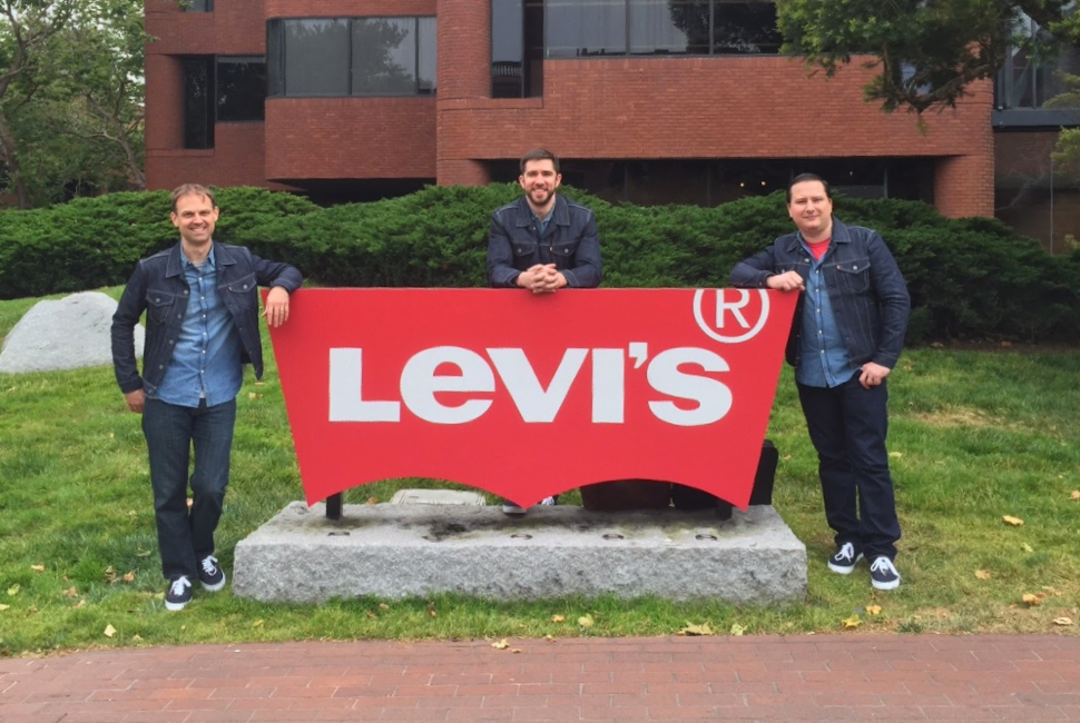
Part of the culture fit for us is embedding ourselves on the team such that there’s a seamless integration and collaboration. We teased this at one meeting by presenting our work dressed head-to-toe in all Levi’s branded denim apparel (including our shoes). While explaining that we had intentionally dressed to demonstrate that we were 100% a part of the Levi’s team, you’d never know that we were actually from Bitovi. We all ripped open our shirts to reveal the Bitovi logo underneath.
While the scene itself was a riot, we’re genuine when we say that that’s how we view our client partnerships. We are so passionate about the success of our client’s project that we go out of our way to make our team become part of theirs. The Levi’s team later told us they’d never had another consulting company arrived dressed in all denim. We’re just that geeked out.
Stitching it Together
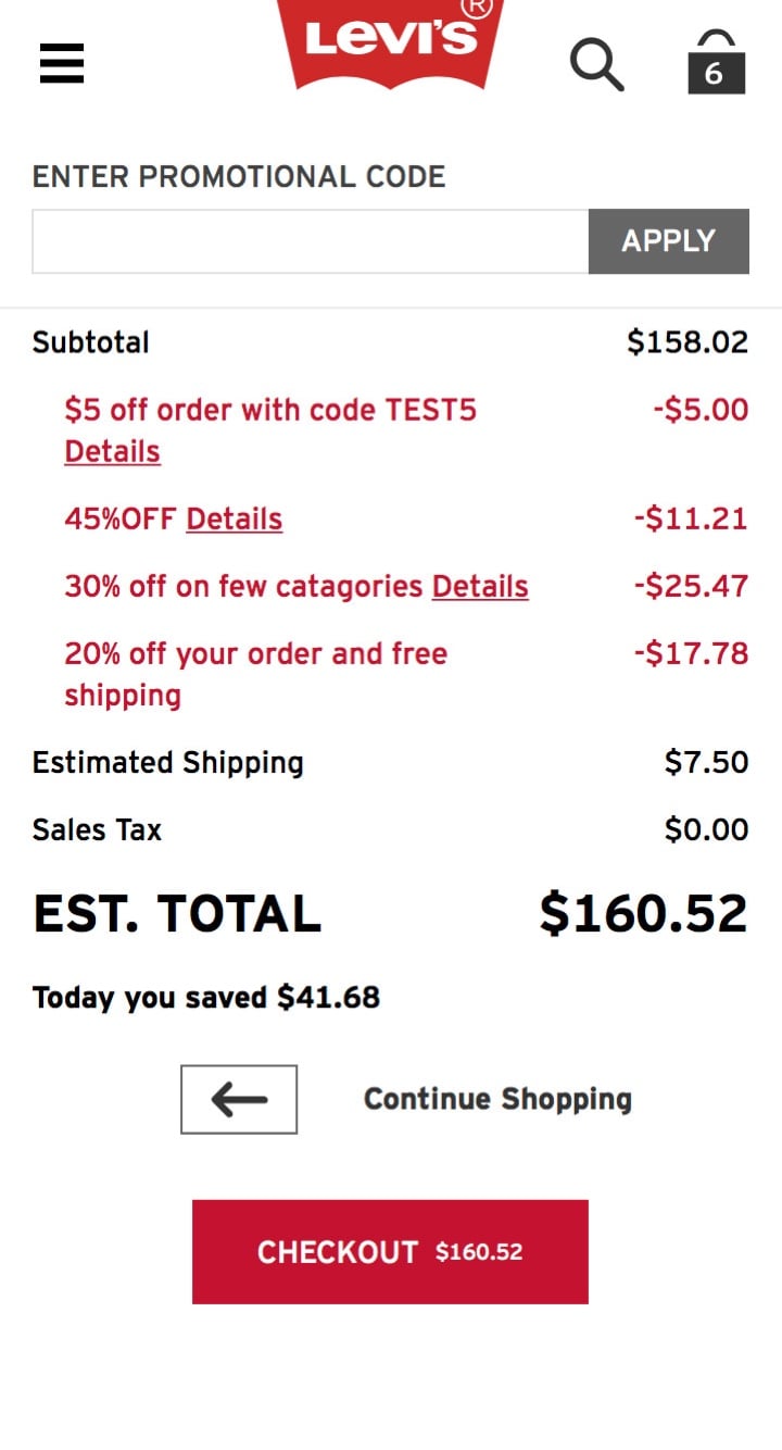
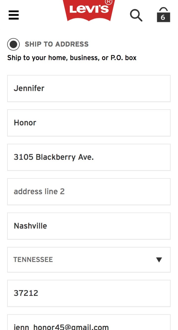
Once the primary technical questions were answered, our team set to work building the foundation for the entire platform. With React in the center and DoneJS as the wrapper, we built a series of other tools to support high-end eCommerce, like server side rendering. At the same time, our design team worked closely with Levi’s to take what had previously been multiple, fixed experiences and turn them into a single, refined flow that would carry customers through checkout.
Our goal was to create a platform that would see improved conversion, in addition to the benefits of a single codebase. With a focus on conversion, we started the redesign effort at the bottom of the eCommerce funnel with cart and checkout. This part of the eCommerce application was the most critical, in terms of influencing conversion, and we knew if we could prove an improvement in the cart - it would lay the foundation for the rest of the site. To test it, we agreed on an A/B test to measure the old site against the new in production.
With the new cart and checkout complete, we watched the results come in from the A/B test and were ecstatic to see the new single-page app win easily. This confirmed our assumptions that performant, responsive eCommerce application would yield higher sales than the previously disconnected experiences on different platforms.

Click N Collect
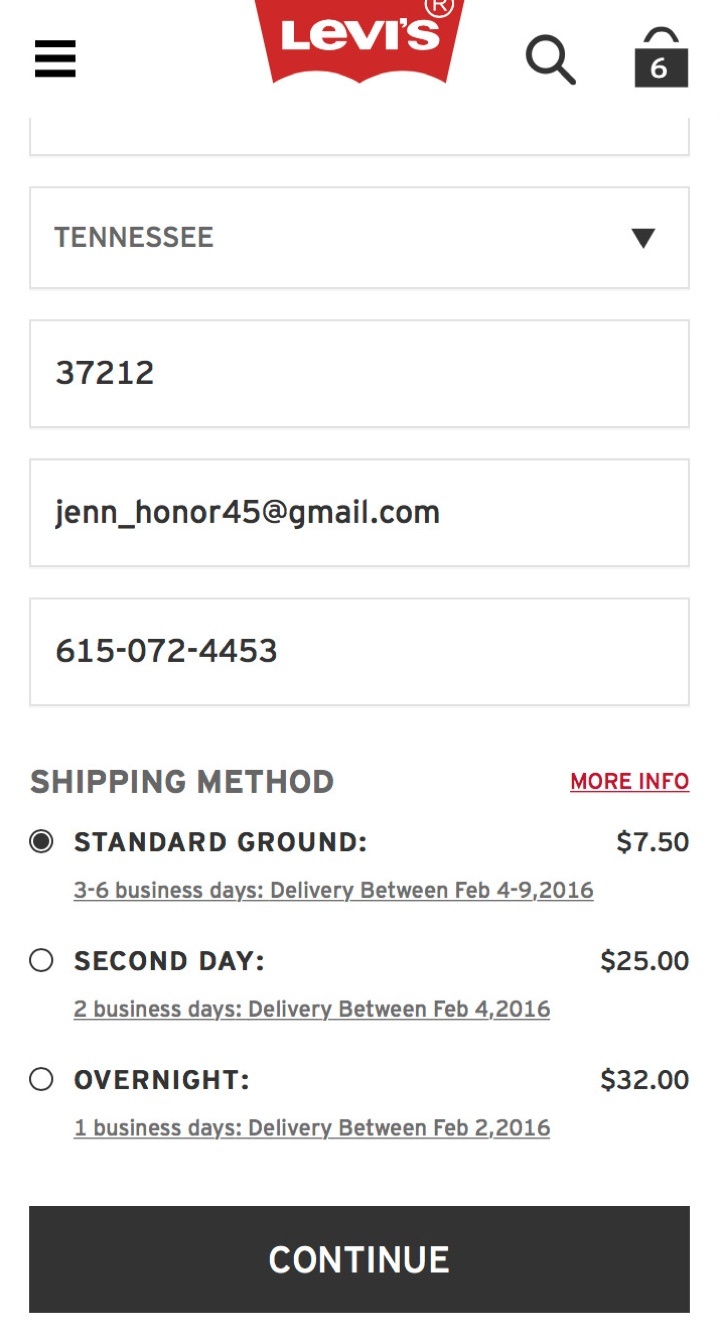
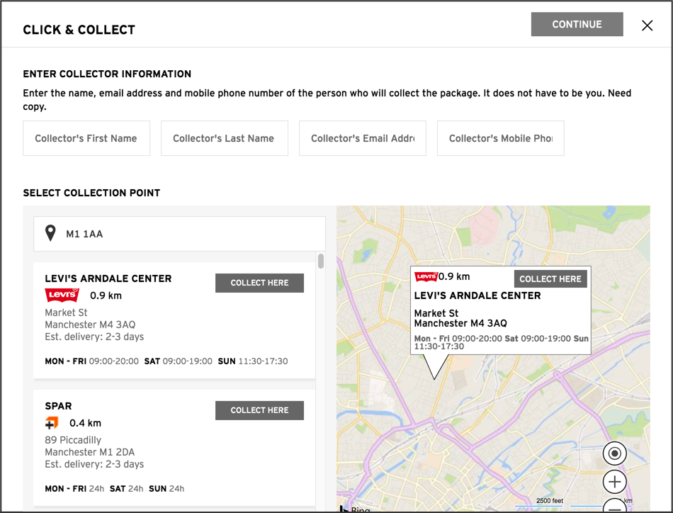
In addition to our work on cart and checkout for the global site, we also partnered with Levi’s European teams to leverage our platform to deliver click ‘n collect - a checkout option where customers can choose to pick up their order at a nearby convenience store or locker. Because our app relied on an open API and modular components, we were able to add this functionality to European markets without affecting the primary site’s checkout flow. This late addition to our project scope demonstrates a key benefit of our architecture: changes in the requirements are not as costly when the application is designed from the beginning to be modular.
Style Guides and a Component Library
Another part of our process at Bitovi is creating more than just a single project, but to build an entire system of modular components that our clients can extend, re-use, and deploy on other applications they might also maintain. Our approach was no different on Levi’s. Not only were we building a next-generation eCommerce app for this one project, but we were also designing an entire library of interface elements that they could use anywhere.
For our designers, this involves following a process called Style Guide Driven Development where our design decisions are not only vetted for the specific context that we’re designing in, but they’re created with an eye toward modularity and a standardized system. This is expressed in a live style guide, a standalone website hosted internally that documents every button, form element, and component in the application. Because the guide is auto-generated from the application’s code, it stays up-to-date. Stakeholders have a reference for design decisions, designers have a library to build from, and developers know exactly what needs to be built. It’s a win-win-win.
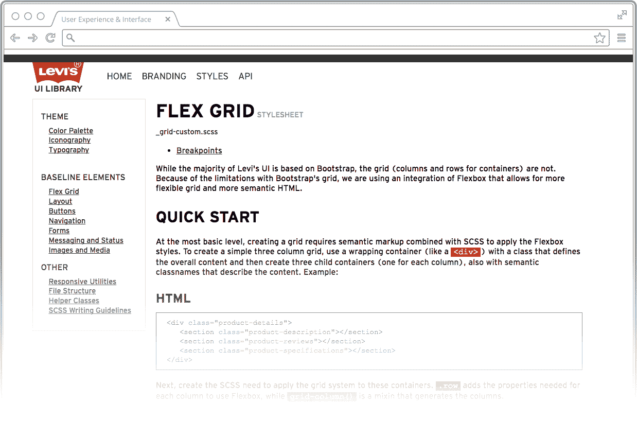
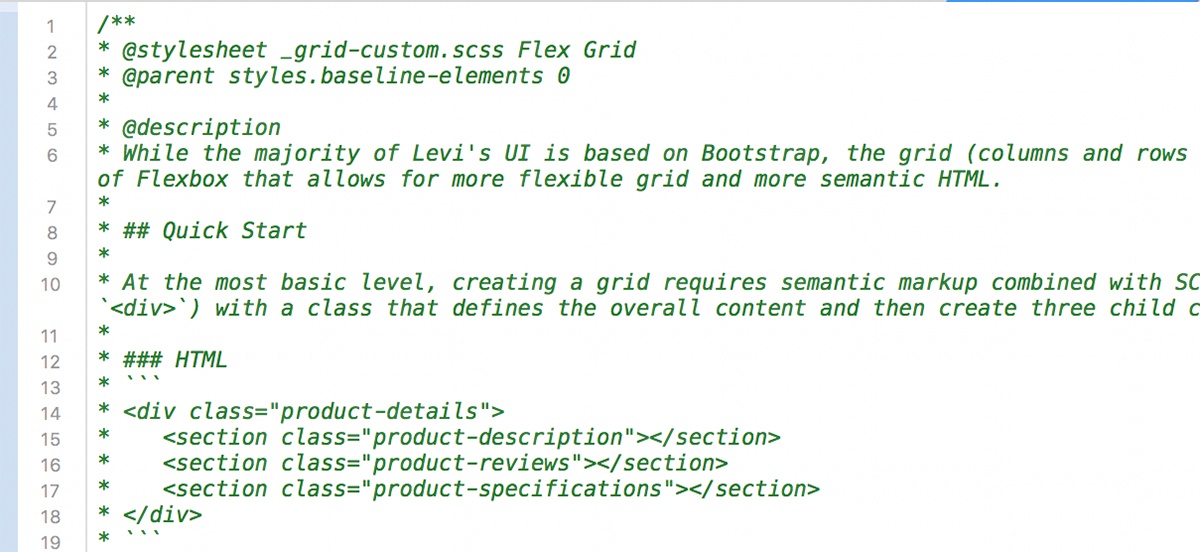
The Levi’s guide included not only technical information, like API docs or HTML elements, but also branding, color, and font information. In the end, we delivered a comprehensive guide for building applications at Levi’s that their team could continue to refine and use on any future application.
The Flexbox Grid System
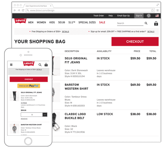
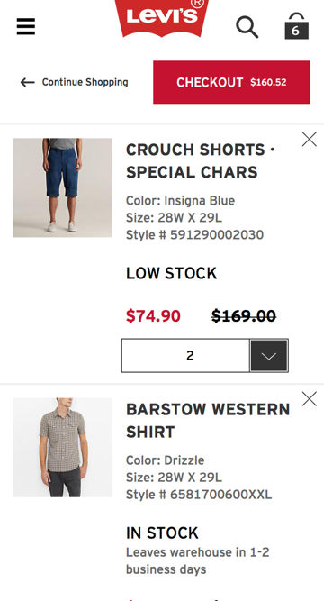
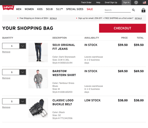
Many sites utilize a CSS grid system for layout and Bootstrap is a popular choice. The existing Levi’s site used Bootstrap, so their team was already familiar with those common classnames. However, the Bootstrap grid wasn’t flexible enough for us in many cases where the designs for a mobile device greatly differed from the layout on a large desktop. To solve for this, we chose to integrate Bootstrap’s core CSS, but created a unique grid system with Flexbox behind the scenes. The Levi’s team could write Bootstrap columns just as it’s documented, but those columns would render as flexbox containers, giving us the ubiquity of Bootstrap with the flexibility and ease of Flexbox.
A Fashionable Application
By the end of our engagement, our team had built a best-in-case eCommerce application for one of the world’s most honored brands. The A/B test was conclusive that the responsive, single codebase was the best choice for the future. We established the foundation for every future component, page, or application at Levi’s going forward. Not only that, but we provided them with the open source tools, documentation, and design system for them to own their new platform long-term. Just as Levi’s denim is known for it’s durability and quality, our team is proud to have brought those same qualities to their eCommerce experience.
Can we help you make an amazing app too?
Contact us and let's create something amazing.