Sam's Club
Membership giant overhauls their ecommerce experience
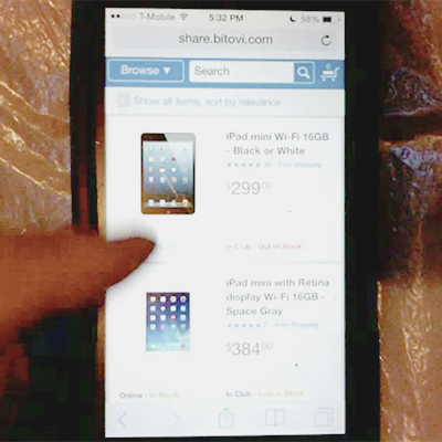
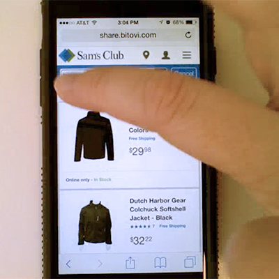
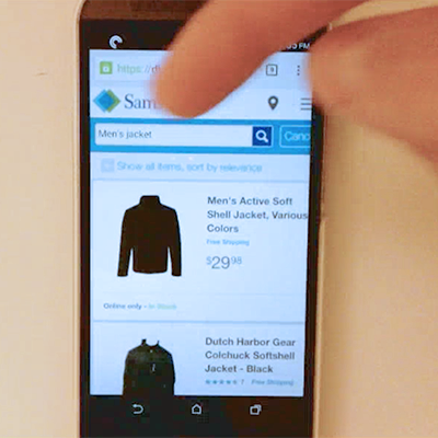
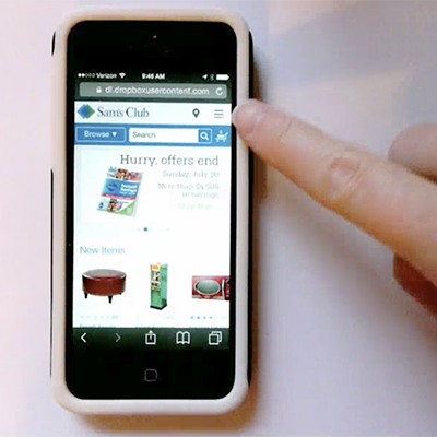
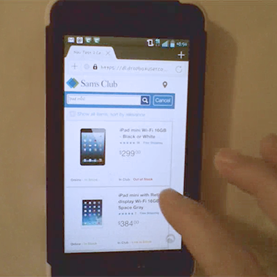
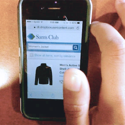
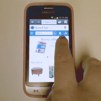
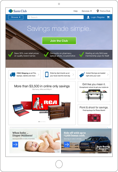
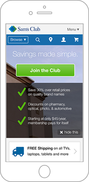
When Walmart decided to bring new life to their Sam's Club online experience, they needed more than just a simple refresh. From top to bottom, they needed a complete rebuild of their ecommerce user experience and technology. Working with our team at Bitovi, the Sam's team built a modern ecommerce application on a responsive design framework that would look great on any device, from phones to desktop computers.
During our initial discussions about the challenges the Sam's team faced, we knew that this was more than a simple ecommerce optimization. The business requirements and specific use cases of members required that we focus our efforts.
Together, we identified several key areas:
- Mobile conversion - compared to other mobile platforms, the Sam's mobile site suffered from unusually low conversion that had to be improved.
- Team duplication - separate teams managed iOS, Android, desktop, tablet, and mobile web apps with separate tech stacks, often without design or feature parity.
- Performance - we needed a modern, single-page front-end with better between-page performance, but without sacrificing SEO.
A Month of Discovery
Having worked with Walmart's mobile team before, we were a perfect fit to help the Sam's team solve both their design and technical challenges. Under the leadership of a new CEO, Sam's Club hired Bitovi to spend one month building a proof-of-concept single-page ecommerce application that was designed responsively to scale for every device from large computers to smartphones.
Optimal Performance
During that month, two developers built the first version of what would become server side rendering (SSR) support in DoneJS before anything similar existed in the JavaScript community. The technical goal was to support loading the same application from the NodeJS server that would be running on the client, without any code modifications.
This was accomplished using a counter that tracked the number of open asynchronous actions.






Design Research
Meanwhile, our UX Director, Tom Greever, collected data from many sources (analytics, A/B test results, user studies, and heuristic evaluations) to create a vision for making a responsive app that would drive up conversion and excite customers.
At the end of the month, our team presented our findings to executives, engineering leads, and the design team.
Not only had we solved for all of the outstanding questions, but we deployed a real, working application to demonstrate our solutions using responsive design, progressive loading, and server side rendering.
They liked what they saw and gave us the go-ahead to move forward with our proposal.
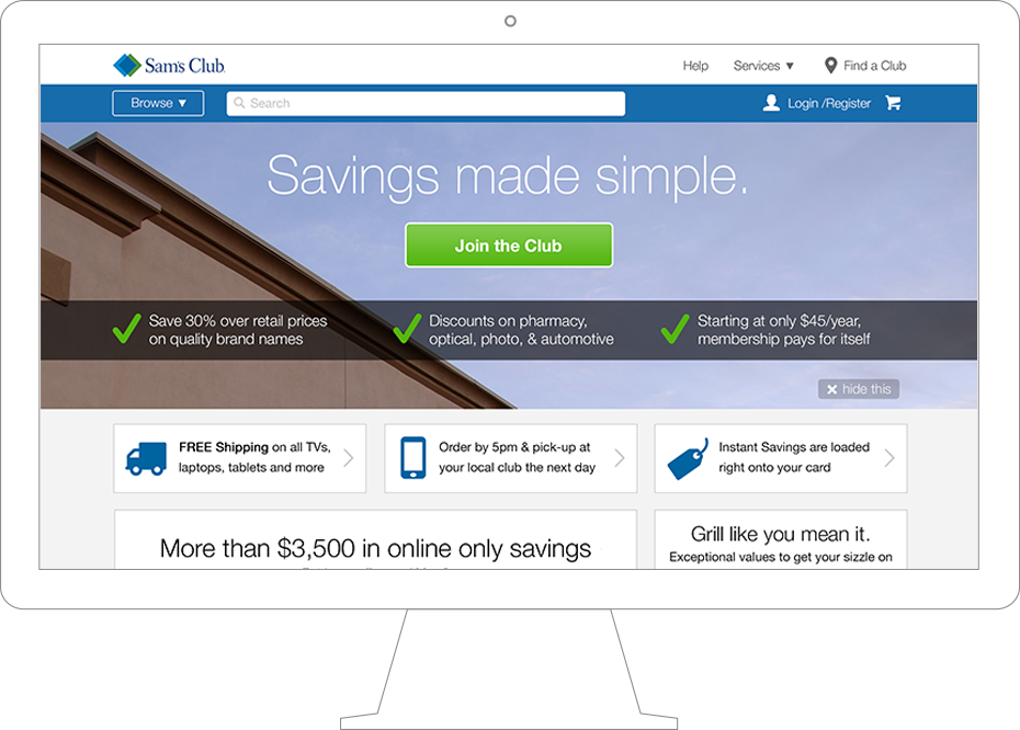
Building the Future of Sam's Club Online
At the conclusion of our discovery phase, we took everything we learned and began immediately applying it to build out the future of Sam's Club online.
Approach
The task of rebuilding an exceedingly profitable ecommerce hub is a large and risky task. We took steps to try to balance introducing positive changes incrementally, without risking major changes that could affect an established business.
Progressive Enhancement
Because of the large number of teams and people involved (and because we wanted to get something into production sooner than later), we agreed to divide the initiative into separate phases, each of which could be designed, built, and deployed alongside the existing sites.
This more agile approach would allow us to frequently improve the Sam's properties over time - and reap the benefits sooner - rather than wait months and deploy an entire application at once (like a waterfall-style approach).
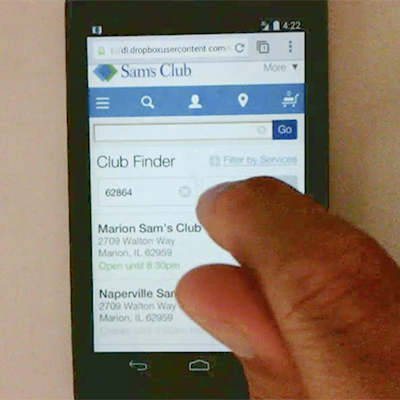
This meant running the old and new sites side-by-side, which also meant shared sessions between the different parts of the site. To minimize risk, we began with the store finder utility, a low impact part of the site that would allow us to validate this architecture without any conversion impact.
Improving UX, Minimizing Impact
Despite the fact that this was a re-design of the Sam's Club experience, our phased approach to deploying changes meant we had to find a balance between improving the overall experience and not creating a drastic new look that would confuse Sam's members.
Complicating things further, all three platforms (desktop, mobile web, and native mobile apps) each had slightly different designs and patterns.
Our task was to balance the need for improving conversion rates while bringing the platforms together, and yet not make drastic design changes. Our final designs ended up favoring the native apps, while also including known elements from the desktop site to make for a smooth transition down the road.
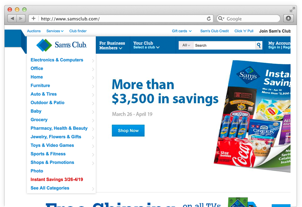
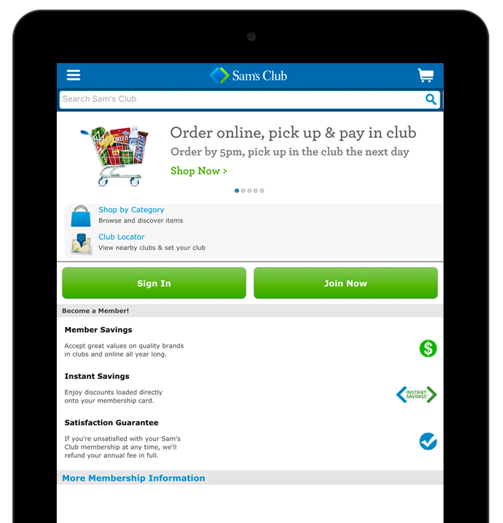
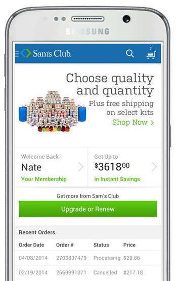
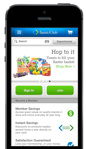
The original suite of Sam's applications all had slightly different looks.
Performance Improvements
We took every possible opportunity to improve performance. Studies suggest that even minor performance gains lead to substantial improvements in conversion. Simply converting Sam's from a traditional web experience to a single page app led to immediate performance gains, as transitions between steps no longer required a full page reload.
Progressive Loading
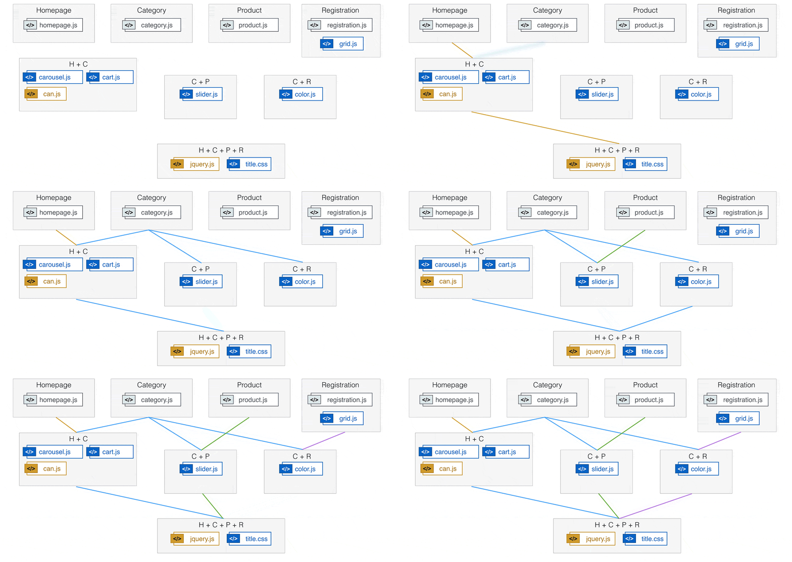
We made additional performance improvements by building parts of the app into optimized bundles, which were loaded progressively, as needed. To accomplish this, we used StealJS's progressive loading feature, which automatically optimizes bundles at build-time to balance shared dependency reuse between "pages".
Instant Category Browsing
Not everything we did to improve performance was complicated.
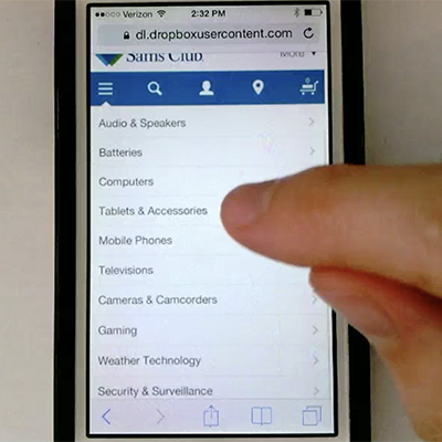
One very simple technique we implemented was caching the entire list of categories and subcategories for every product on the client. We discovered that one of the biggest complaints among users was that the page paused to load new data every time they chose a new category. By caching the entire list, navigating the multiple levels of the Sam's catalog was instantaneous.
UX Improvements
One of the keys to improving conversion is reducing confusion. Here are a few examples where our design team studied user behavior and recommended subtle changes that led to big improvements.
Menu Usability
Even though we had a lot of data to understand how people used the site, we still needed to test our assumptions about the changes we were making to be certain that it would be easier for people to use.
One critical question we asked was: what is the best way to describe the menu for browsing the categories of products? The words "Browse", "Shop" and "Categories" were all options, as well as icons. To find out, we ran a series of unmoderated usability tests with variations of our prototype.
We discovered the words Browse and Shop were only obvious to people about half the time, while icons like the hamburger and down-pointing arrow were nearly meaningless. The winner in our tests was the word "Categories" - which was nearly always the most obvious choice for people looking to browse products.
Add to Cart Interaction
Another one of our goals was to increase the add-to-cart-rate. This interaction was complicated by the Sam's business model in which products can have a separate online and in-store price.
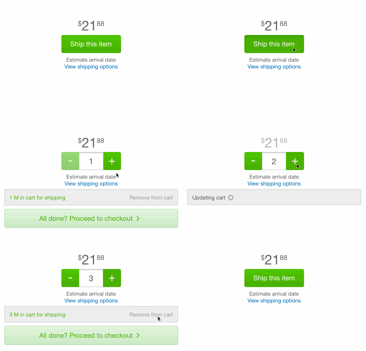
Despite these constraints, our design team created a unique interaction that simplified adding to cart and reduced the number of clicks.
Users add items to their carts with a single tap, while changing quantities, managing add-ons (like protection plans), or removing the items in subsequent interactions.
Smart Search Suggestions
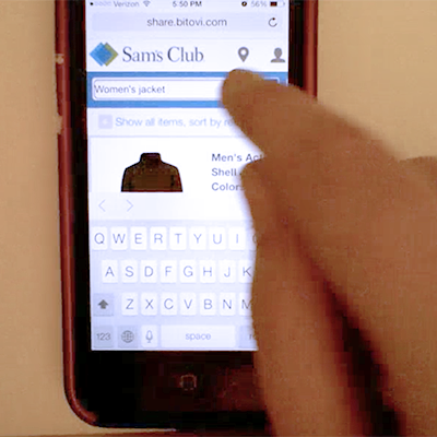
While analyzing search data, our team discovered that people were using the product search bar to search for terms that weren't products - such as "membership" or "credit card". Because the search engine wasn't a 'site search' feature, they would get a "product not found" page.
Since refactoring the search engine wasn't in scope, we needed a simple way to help users find what they needed without re-writing the API. Our solution was to "intercept" these users with a banner at the top of the search results page which recommended an appropriate page or category.
Long Term Success
We aim to leave every project in a great position to succeed without us.
The Open Source Insurance Policy
While we've worked with every modern JavaScript framework, one of the benefits of partnering with Bitovi is the ability to tap into the core open source team behind the tools that we develop - CanJS, DoneJS, and StealJS.
Having direct access to the team that makes the tools means reduced project risk because we can fix bugs that arise or add features needed for the project. This just isn't possible with frameworks like Angular (owned by Google) or React (Facebook).

A great example of this happened during the Sam's project. During the regular course of our work, one of the Sam's developers discovered a bug. With other open source frameworks, it might take hours to confirm the bug is within the framework as well as days (or even weeks!) to research workarounds or a fix.
On Sam's, we were able to bring in one of our open source developers immediately - via comments on the Sam's Github repo.
Within a couple of hours, the bug had been fixed in the framework and Sam's was upgraded to the new version. This level of ownership is what makes our app development process so effective.


Long-Term Ownership
As we built this foundational platform for Sam's, we also worked closely with their management to hire and train a team to own the product long-term. Our goal was never to build an app and drop it off on their doorstep, but to build a product that they could maintain long-term with or without us.
Over a period of six months, we scaled back our team while the Sam's management team hired our replacements, making for a smooth transition into long-term ownership.
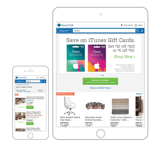
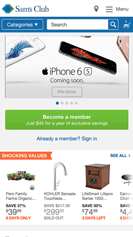



What we delivered was a modern, single-page ecommerce platform that could be deployed across any device from large desktops to mobile web and even packaged for native iOS and Android apps. Our improvements to the UX and technical performance resulted in a significant increase in conversion.
Today, Sam's Club is in better shape than ever to tackle the challenges of major retail online and they have a scalable, modular platform with which to build upon. We are honored to have been part of the Sam's Club team.
Can we help you make an amazing app too?
Contact us and let's create something amazing.
