Application + style guide = smart buy
A recent project called for the creation of a single page site that would showcase a real estate agent’s expertise, sales history, professional connections, and various other impressive attributes. Pages would be generated using a fill-in-the-blank template. Eventually, two additional real estate agencies affiliated with our client would make their own versions of the page, identical in function, but with slight changes in styling and content. Future brand-specific styling variations would need to be documented somewhere, so Bitovi offered to provide a fill-in-the-blank re-usable style guide to go along with the template page. Both the template and the style guide could be cloned and restyled as many times as desired. Hence, our client bought themselves a cookie cutter vs. paying for one cookie at a time.

Choosing Storybook
There are plenty of living style guide generators on the Internet (see Alternatives to Storybook below), but most are far too simplistic and inflexible to be viable options. The style guide solution we chose needed to fulfill the following criteria.
- Flexible and customizable – To paraphrase Burger King, we wanted to "make it our way." The tool couldn't break if we started moving things around or did things differently. While we didn't intend to completely overhaul a tool's appearance, some customization was desirable.
- Robust – We wanted more than a single Web page with all patterns on it. You don't need a living style guide generator or design system for that. A "pattern dump" can be accomplished far quicker with simple HTML, CSS, and JS.
- Easy to learn – The tool had to have a low learning curve, not only for Bitovians, but for our client and eventually their internal users.
- Well-supported with a vibrant community of users – Too many living style guides start off with lots of hype, then sit abandoned, with nothing to show for themselves except a GitHub repo that hasn't been updated in 3-6 years. (FYI: Storybook has an active Discord channel and plenty of online discussion in forums like Stack Overflow.)
- Well-documented – When something isn't easy to learn and/or well-supported by fellow users, you at least need good documentation.
- Appealing – The ideal tool needed to be pretty for designers, have plenty of "knobs and dials" (ability to edit code in a sandbox environment) for developers, and feel comprehensive for content authors and executives.
Storybook checked all the boxes, with a few caveats and annoyances mostly having to do with customizing the appearance.
Annoyances
- Storybook is written in React and the project used Vue, so some plug-ins were not available (e.g., Playroom, styled-component-theme, Theme switcher).
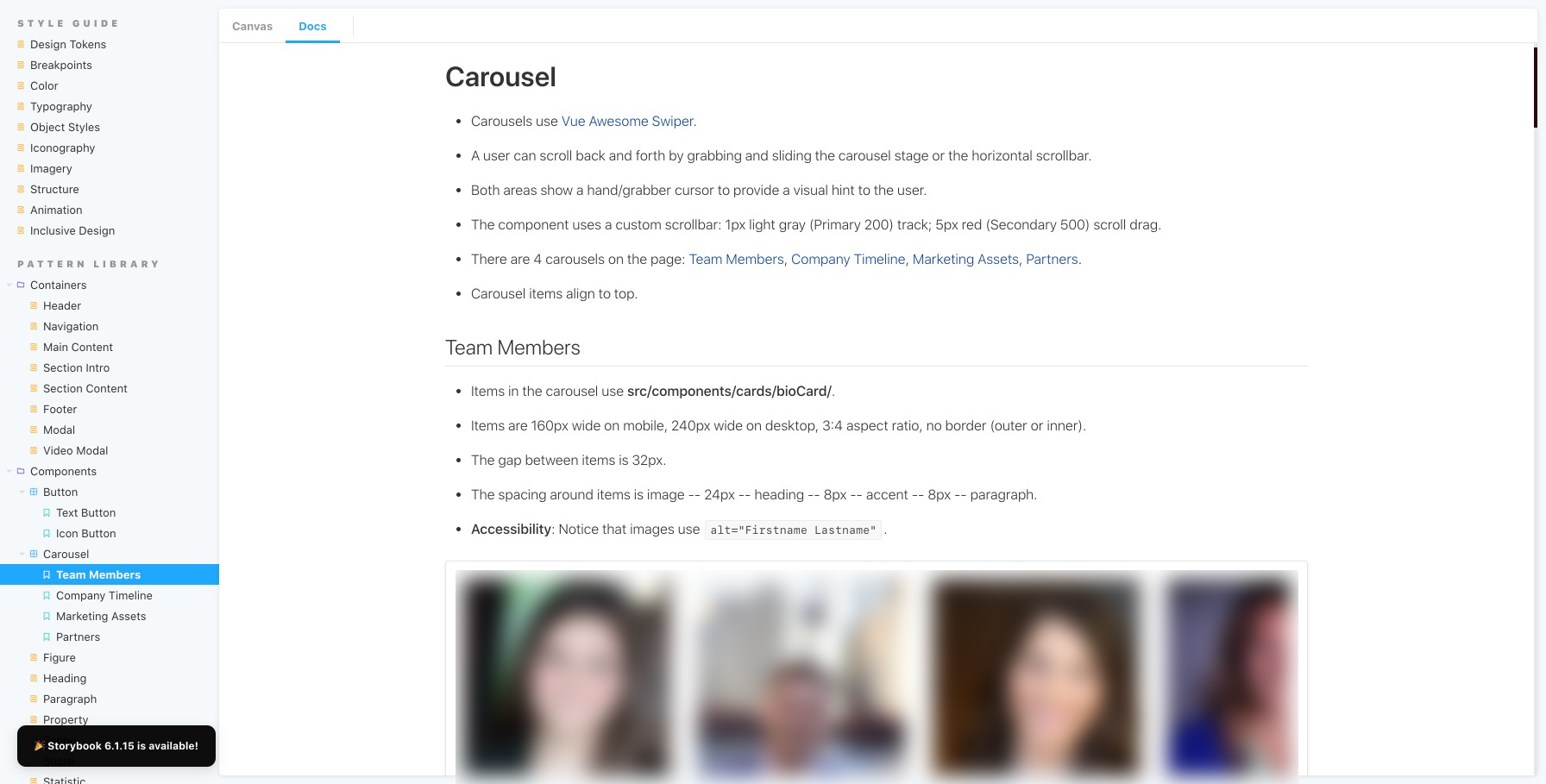
- It is not easy to customize Storybook's appearance. Changing the order of items in the sidebar was accomplished by editing preview.js, specifically
parameters = options: { storySort: order: [ ... ] }. CSS style overrides were added to preview-head.html (e.g.,.sbdocs.sbdocs-h1 { font-weight: 600; }). However, CSS changes made to preview-head.html would not refresh on their own (even after doing a page refresh and clearing browser cache). So any time a styling change to Storybook was made, you had to manually make Storybook rebuild (and restyle) itself by switching the theme (i.e., in preview.js, toggling betweenparameters = docs: themes: theme.lightandthemes.dark). - While you could include multiple
<Story>tags in one<Canvas>tag, you couldn't style or position story components at all. For example, if you had a light version of a button and a dark version of a button (story 1 and story 2 inside a canvas tag), you couldn't put one on a light background aligned to the left and the other on a dark background aligned to the right. You could do this if you used<Preview>. Both<Preview>and<Canvas>would display the component(s) and show code, but<Preview>showed HTML whereas<Canvas><Story>showed Vue code, and only<Story>would link stories to the MDX documentation. - You could not import the contents of a file (i.e., SCSS) into
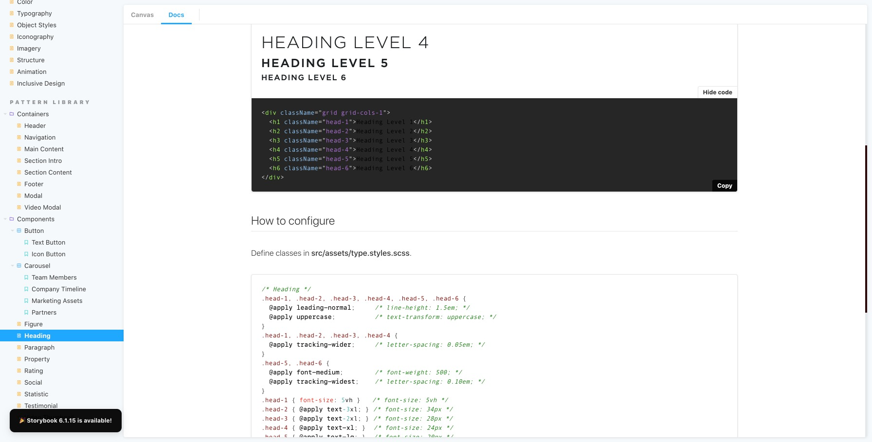
<Source language='scss'. Instead of just updating a SCSS file and having Storybook "suck it into" documentation, it had to be manually copied and pasted over, which created opportunities for documentation being outdated, having mistakes, and getting out of sync with code. - It was not possible to customize the appearance of the Prism syntax highlighter. This meant that HTML, CSS, and JS code examples had inconsistent styling. They had a light background when they appeared on their own (with no accompanying pattern preview) using
<Source>, but had a dark background when they appeared along with a pattern preview using<Canvas>or<Preview>. The whole point of a design system is consistency, so this was frustrating.

Alternatives to Storybook
Your JavaScript framework (e.g., Angular, React, Vue, Ember, Node) and CSS flavor (e.g., SCSS, LESS, vanilla CSS) will be the biggest factors in determining which living style guide options are available to you.
No framework
- Roll your own – write HTML, CSS, JS yourself; works with any front-end stack. Read our article, Style Guide Driven Development: A How To Guide To Improve your Development Workflow.
- Frontify – a cloud-based subscription service with the ability to have a style guide, pattern library, as well as image, icon, and document digital asset management (DAM) system.
Node.js
- DocumentCSS - Read our 3-part tutorial, Creating a Living Style Guide.
- Fabricator
- Knyle Style Sheets (KSS)
- StyleDocco
- StyleDown
Ruby
- Hologram
- Knyle Style Sheets (KSS)
- The Living Style Guide – also has a Gulp version
PHP
There are others, but they come and go, as does their user community, documentation, and support outlets.
Bottom line: Storybook is the best design system tool to date
When you’re in the early stages of creating a design system (e.g., playing around in Sketch, Figma, making mood boards), all the tools available for creating “living style guides” look about the same. You may be tempted to use something WYSIWYG like Frontify or just make a simple HTML page showing all patterns. After all, these are the easiest to “make pretty” and customize for your brand. However, once your design system ages up, grows bigger, and has seen several rounds of changes, your goals for what a design system tool should do will change also. Suddenly, you need features that can search and summarize in bulk, save time, avoid mistakes, and decrease duplication. This is where Storybook shines. Ask yourself, can my design system tool do that? Storybook can.


.png)

