Imagine this: you’re a designer who has been tagged on a pull request as a reviewer. It’s up to you to look at the changes made and decide if you are going to approve them and let them frolic with the rest of the app code.
If your team is anything like the teams with which I’ve worked, you’re the only one really scrutinizing the styles and HTML. And if you’re anything like me, you don’t like to add your name to something unless you’re confident it’s good work. So how do you figure out if this PR is any good?
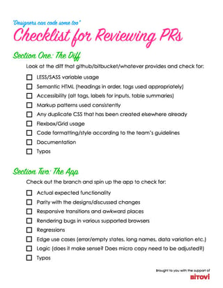
While bringing a new hire up to speed, I was explaining some of my processes and told him I have a mental checklist. The obvious thing to do was to turn my mental checklist into an actual checklist, so I could share it. Bitovi LOVES checklists, so now you can download the PR Checklist, to get some help covering all your bases. And if you stick around, the rest of this article will go into a bit more detail about it.
Click the image above to download a PDF version
Break it down now
The checklist is broken into two main sections:
- “The Diff” in which you review the code and look at the difference between the pull request’s changes and how the application already works.
- “The App” in which you run the code and interact with the app locally on your machine.
The Diff
All the items in “The Diff” are to help ensure the code is well-written, maintainable, and usable (or at least can be understood) by other team members. Code written without thought for semantics, style, previously done work, or modern tools make an application an increasing nightmare to work on.
Make sure the code in the pull request uses your UI framework as expected and uses new layout tools (like CSS Grid or Flexbox) accurately. Also, including documentation can be paramount to maintaining the application. If you’re not following the Style Guide Driven Development model of writing HTML/CSS, then at least include some code comments on more complex pieces. It can save you a lot of troubleshooting later.
More specifically here's a rundown of each item in The Diff:
- LESS/SCSS variable usage: Are variables being used often and appropriately?
- Semantic HTML (heading levels in order, tags used appropriately): Are HTML tags being used to convey meaning (semantic) or just presentation (non-semantic)?
- Accessibility (alt text, labels for inputs, table summaries): Are WCAG 2.1 accessibility guidelines being followed in the markup?
- Markup patterns used consistently: Is code easy to read, maintain, and reuse?
- Any duplicate CSS that has been created elsewhere already: Does code need to be made more global or put into a mixin for better maintainability?
- Flexbox/CSS Grid usage: Can floats and hacks be avoided through the use of modern and better layout styles?
- Code formatting/style according to the team’s guidelines: Is code written neatly and in accordance with team standards? (e.g., indent 2 or 4 spaces? 0 or 0px? Alphabetize attributes? Use px or em or rem or %?)
- Documentation: Does it exist? Does it make sense?
The App
All the items in “The App” are to help ensure the code is taking the project forward, and not in circles (or worse: backwards!). Actually running the code can enable you to catch weirdness or errors that would have otherwise been impossible to see by just reading the source code. I’ve been writing CSS for around 15 years, but “The icon in that button isn’t centered” is not information I can usually glean from a code diff.
The other most important thing running the code can reveal is bug regressions. Sometimes editing CSS can feel like this gif:

It’s much easier to see if one bug is going to replace another if you’re looking at the actual app.
More specifically, here's a rundown of each item in The App:
- Actual expected functionality: Does the code branch actually work locally in a browser?
- Parity with the designs/discussed changes: Does the app look how it should?
- Responsive transitions and awkward places: Do things get weird at various sizes? (Especially check tablet screen size ranges!)
- Rendering bugs in various supported browsers: Does it look broken in any browser? (Looking at you Safari and IE.)
- Regressions: Does new code break any old code?
- Edge use cases (i.e., error/empty states, long names, data variation, etc.): Is there error handling? Empty messages? Does text wrap without breaking the layout?
- Logic: Does it make sense? Does microcopy (i.e., label on a call to action, placeholder text, hints, and error messages) need to be adjusted?
- Typos: Are there any typos you didn’t catch in the code that you catch when they appear on the screen (e.g., JavaScript-generated messages)?
Gain Confidence
This checklist is meant as a guide to help you keep track of everything going on and to feel more confident that you’re approving high-quality work. If you haven’t already, download the PR Checklist, or feel free to make your own checklist. Any list will help you keep track of all the moving pieces.
Bonus Hint: Use this checklist before submitting your own pull request to feel good about the code you’re presenting to coworkers.
Bonus Content: If you're reviewing a design (vs. code), we have some Simple Tips to Quickly Check a Design for Usability.
Need a UX designer? We can help.
Previous Post
Next Post


.png)


