
When designing web and mobile apps, we aren’t fully delivering experiences that allow the user to control the interface in a way that makes sense to them. We talk about delighting the user and having empathy, but more often than not, we tend to miss the mark and deliver a frustrating experience. It's time that we consider giving the user more control with how they prefer the interface to function.
Designers are missing the opportunity to create configurable options for users. This article will help you get started with designing a configurable interface.
In this article we’ll take a look at:
- What is a Configurable Interface
- Why Configurable Interfaces are Not Popular
- Why Users Prefer a Personalized Experience
- Example Configurable Interface Templates
- User Testing this Concept
What is a Configurable Interface?
A configurable interface is designed for the user to have the ability to modify the way the software or app looks and works. It can also include the option to choose what data is displayed within each panel.
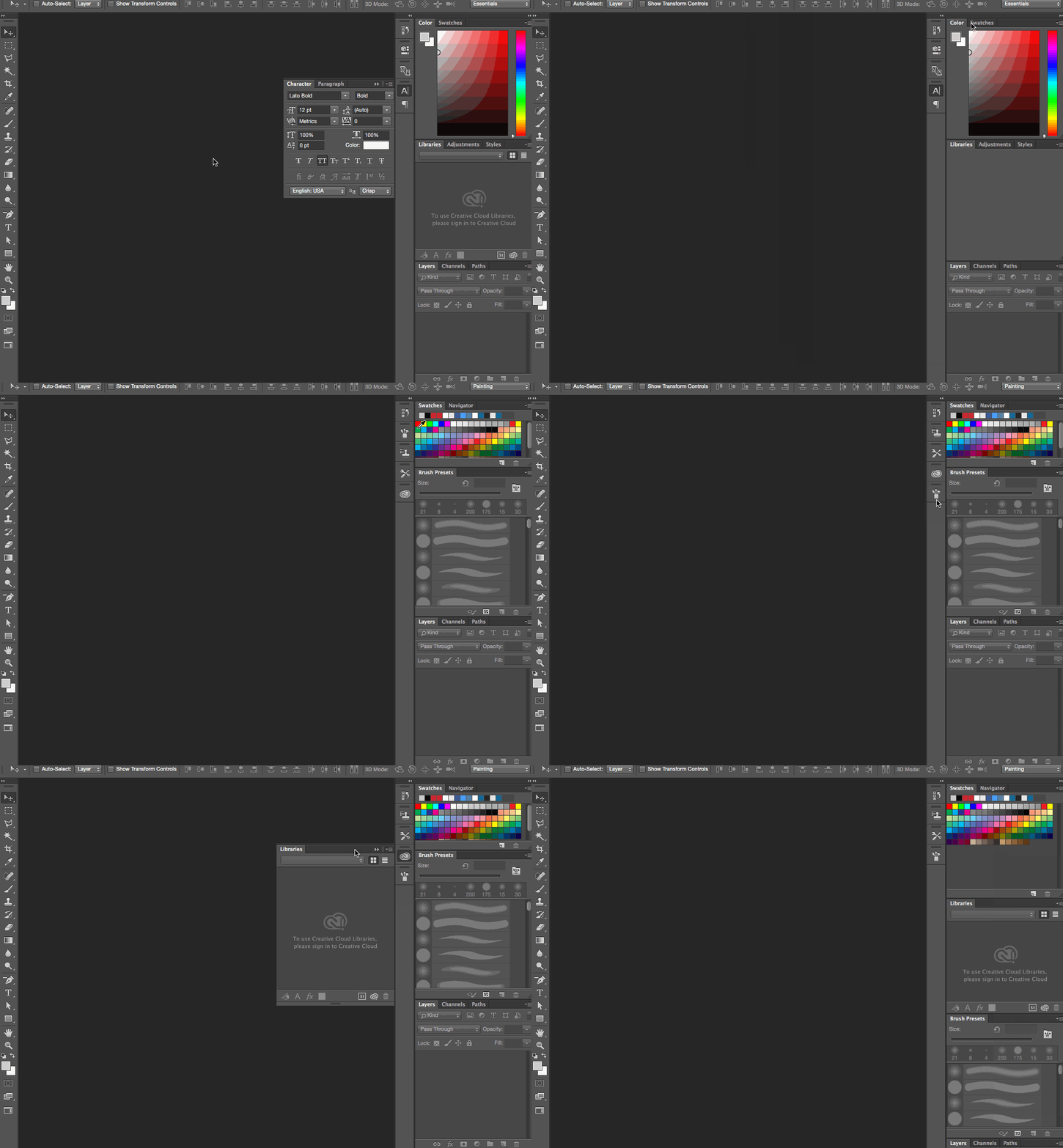
For example with software, Photoshop offers a great deal of customization:
- layout: where panels float and how they are attached to each other
- appearance: different color schemes, font sizing and more
- user defined: save your own custom mix of layout and appearance
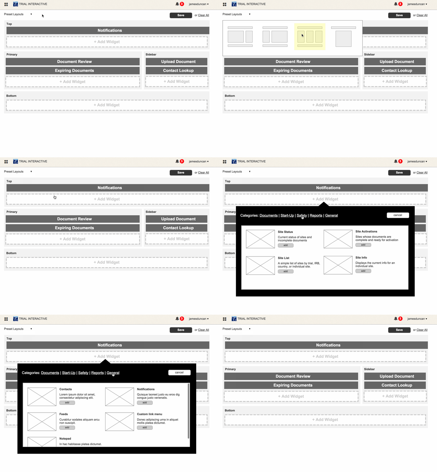
Configurable interfaces can also be used in web applications, though most web apps don’t offer this. In the animation below you’ll see an interactive prototype Bitovi built to test different configuration ideas. We explored preset layouts as well as different widget options the user can pick from.
Why Configurable Interfaces are Not Popular
We don't often see configurable interfaces in apps today because simply put; they are very hard to design, develop and test. Here are a few examples:
- too much control can be confusing and overwhelming for the user
- user testing can be tedious
- app testing and maintenance can be difficult
- configuration options are not always the best fit for most apps
- development and design time can be tripled
While these examples are certainly big obstacles, we should not let them stop us from designing a great user experience. Let's roll up our sleeves, get our hands dirty, and create something users will truly appreciate.
How We Design Apps Now
We currently use methods like user testing and data-driven design to help us design the best experiences. While these methods are helpful, they still might leave the user needing something more.
User Testing
User testing usually only provides feedback to a single interface option, or just a set of tasks. Even if we listen to our users, it can be difficult to meet and understand their needs. Maybe what they really need is configurable options.
Data Driven Design
Data Driven Design only provides partial insight into a set of design options. The data itself is accurate, but it is how we interpret it and the decisions that we make the data inaccurate. If we don’t fully test all possible options available, then we cannot assume we are making a logical decision.
Often, the designer makes the decisions for the user because he or she knows best. In other cases, stakeholders like executives, product or marketing will trump the final decision making. In the end, the user may lose out on the best possible experience if it’s not tailored to their individual needs.
Why Users Prefer a Personalized Experience
Not everyone likes the same style of cooked egg. Some like it scrambled, over easy, over medium, or sunny side up. So why do we expect users to only like one type of interface? What are we afraid of?
As an example, we can allow the user to define the placement of a navigation as a sticky header, or a footer and still make sure that it is designed to work in both positions. Thoughtful interactions and branding pull it all together. By designing an array of preset interface options, the user can now choose the style they prefer, for how they like to use your app. Now THAT is delighting the user.
This design strategy can lead to less complaining from your users. Users won’t be as frustrated if your organization decides to redesign the app. We can avoid a lack of user understanding of what an icon means, if we can design an option to allow them to get rid of icons and display the label only. That is what users want - an experience that allows them to make it their own.

Example Configurable Interface Templates
Good design happens with good constraints, let's look at the following examples of different options that could be offered in a social application to allow for user configuration.
Minimal
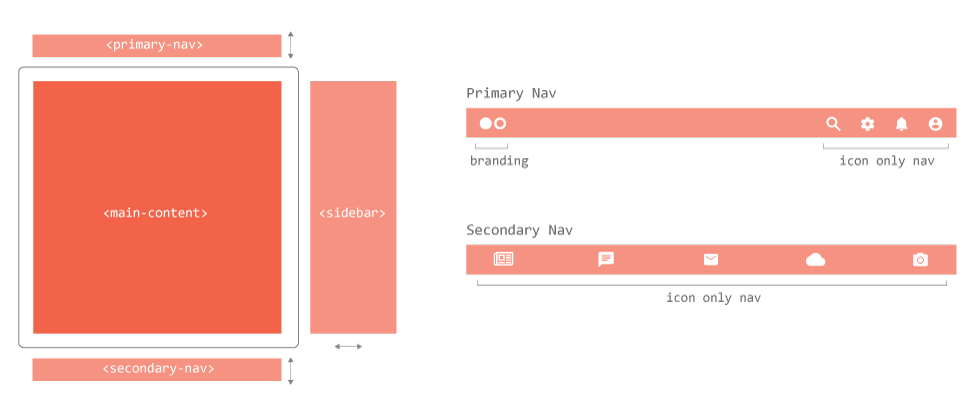
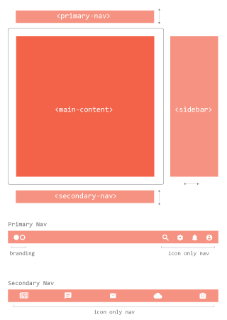
| Description | User Persona: Pro User |
|
|
- minimal interface
- content priority
- icon heavy
- micro-interaction heavy
User Persona: Pro User
- young to middle age
- uses app more than once a day
- fully understands the app
- prefers gestures on touch devices
- interacts frequently with multiple areas of functionality
Standard
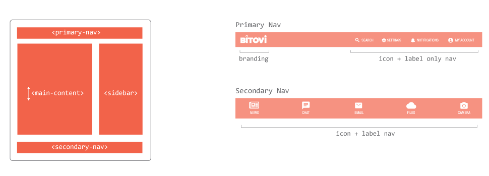
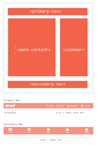
| Description | User Persona: Intermediate User |
|
|
- fixed nav + sidebar
- content scrolls
- icon heavy + label
- mix of micro-interactions and obvious buttons
User Persona: Intermediate User
- all ages
- uses the app a few times a week and doesn’t interact much
- is not aware of configurable options
Expanded
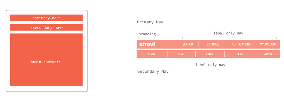
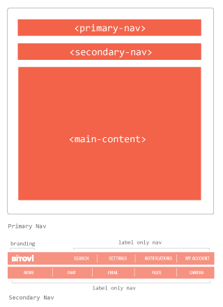
| Description | User Persona: non-tech / disabled |
|
|
- fixed navs located up top
- content priority
- large typography and images
- labels without icons
- large buttons
- obvious interactions
User Persona
- mid-age to elderly
- does not understand complex interface
- requires obvious interactions
- requires big type for readability
- accessibility friendly
Fully customized (drag and drop elements to selected areas)
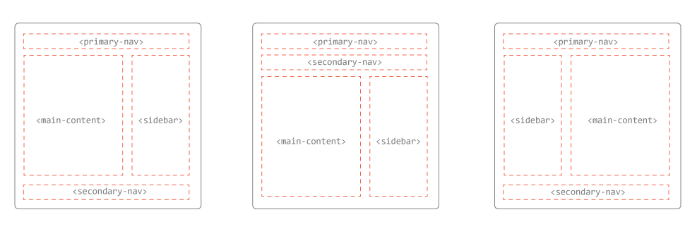
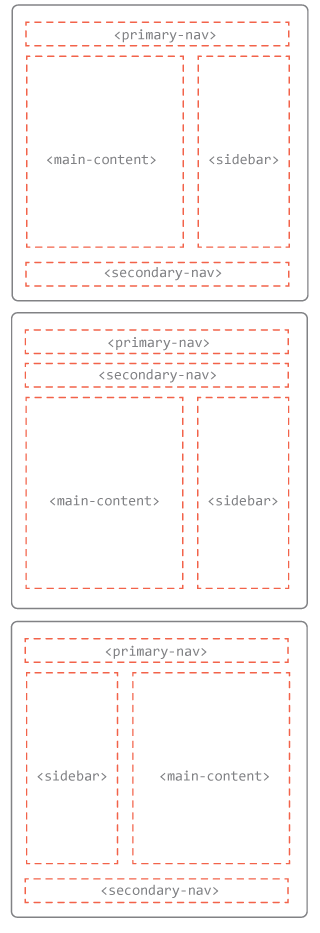
| Description | User Persona: savvy pro |
|
|
- user can move interface components to desired location
- user can choose from any of the options to complete their theme
User Persona:
- young to middle age
- uses app more than once a day
- fully understands the app
- prefers gestures on touch devices
- interacts frequently with multiple areas of functionality
Configurable Data Options
In addition to configurable layout we can also provide options that allow the user to choose what type of data (content) they want to see inside the app. Here are a few examples of what a user might want to choose from to improve their personal experience.
- which data type or category of content
- rearrange the order in which data appears
- view suggested data from outside sources
- allow friends to influence the data
User Testing this Concept
To see if this idea has traction, I decided to chat with some of my family members to see what they might want from a configurable interface. Here are two examples.
User One: Grandfather
Product: GMail
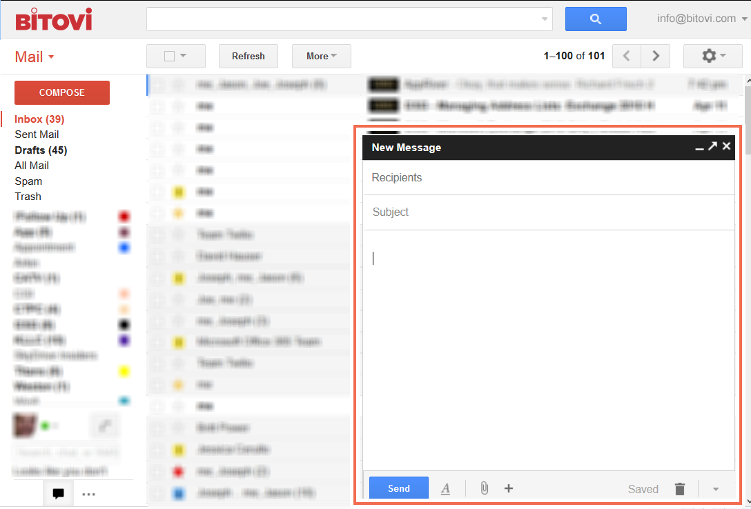
Grandpa doesn’t like how the compose window sits in the bottom right corner and would also like it to be bigger. He clicks the expand window icon, but now that overlays the entire screen. He would like to be able to configure how that works by dragging the window and also being able to view an email.
User Two: Wife
Product: Netflix
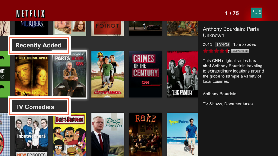
She doesn’t like how the rows of titles are preset. "Why should I have to scroll all the way down to one category every time". She would like to be able to choose the order of certain categories and even which categories show up.
In these two simple user interviews there is definitely a desire for configuration options. This same technique can be used to discover your user's workflows. Understanding how each user interacts and utilizes your app will help you to define different workflows. The workflows can then be used to design the app's configuration templates.
Onward and Upward
This is a short and simple example of how we might allow users to configure native and web apps. Not all of these options will be the right choice for your organization. You might only offer one option to start (appearance, layout, or content). Remember, create good constraints (pre-configured templates) so that your design team can get their job done.
I encourage designers to embrace this in their next project! Bitovi’s team are experts in creating engaging and personalized configurable interfaces. Please contact us if you’re interested in working together.
Cheers to the future my friends.
Previous Post
Next Post

.png)

