


.svg)


We visited fast food restaurants to test how real-life users experience ordering through their websites.
This is part two of our multi-part series on usability issues with fast food eCommerce websites. In each part, we’ll highlight the usability problems (and some successes) we discovered through performing guerrilla user testing(1) at popular fast-food restaurant locations.
We’ll also suggest improvements each website can make for higher conversion rates and increased customer satisfaction.
Restaurants have some of the highest conversion rates in the industry(2), complex menus with lots of options, bundling, and pricing configurations. This series teaches you about fast food’s successes and failures. Let’s get started!
Case Study: Burger King
We're studying how users order at http://bk.com. By testing and evaluating how users navigate the site, we will discuss some of the biggest problems and suggest how we would solve them.

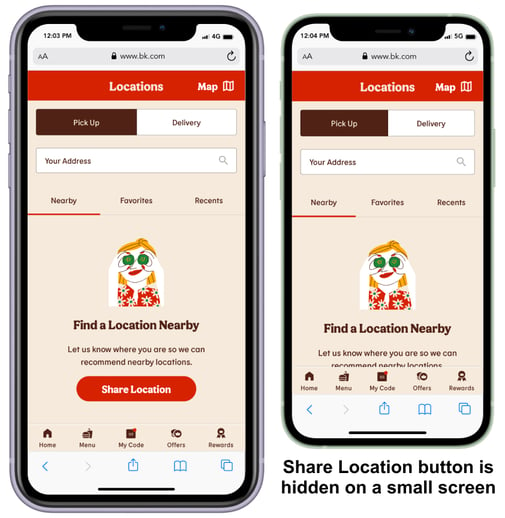
Usability Issue: Button Position
The first usability issue is the “Share Location” button, which is placed at the bottom of the homepage.
When the page is opened on a small screen, the “Share Location” button is hidden. Having the button so far away from the store-finding components creates confusion and makes it difficult to locate.
See the video of a user struggling to find the “Share Location” button.
Watch another video of the user making multiple attempts to find a location by typing.
Solution: Better Placement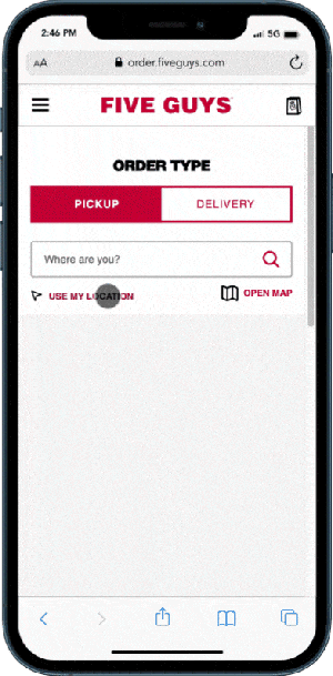
Allowing users to find the closest store location quickly speeds up ordering and reduces site abandonment. The Five Guys site, which has a component that allows users to search using their current location, offers a good example of placement.
When a user clicks the “Use My Location” button, the closest locations are displayed.
On the Burger King site, we would solve the “Use My Location” button issue by moving the “Share Location” button next to the “Your Location” text box. The principle of placing related items closer to each other is related to the Law of Proximity(3) from Gestalt psychology.
Usability Issue: Required Sign In
Another usability issue is the required sign-in, which blocks users from completing their purchases. Currently, Burger King forces users to sign in with a validated email by creating an account before allowing them to pay. The sign-in multi-step process slows ordering by adding friction, leading to cart abandonment rates between 68% and 75%(4).
It takes over a minute to complete the steps required to sign in.
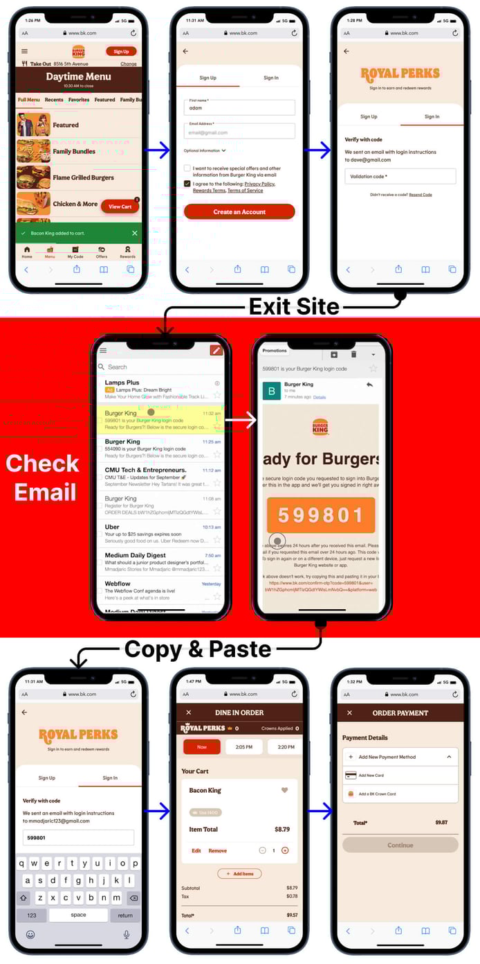
Solution: Remove Extra Steps
KFC’s site provides an excellent competitive example of how to solve the issue. They removed the sign-in and registration processes, allowing users to check out in one step.
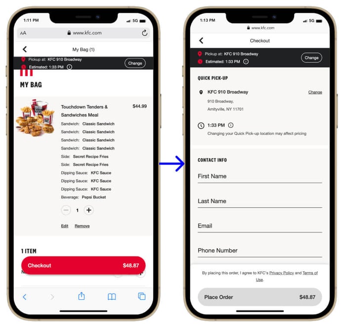
By removing the extra steps, Burger King would allow users to complete the ordering process and pay without abandoning their transactions.
Interrupting a user before they have completed ordering slows the process, preventing quick checkout. Registrations involve extra steps and potential problems. There is a direct connection between user hassle and lost sales(5)
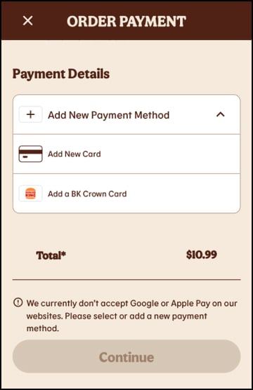
Usability Issue: Only Credit Cards Allowed
On the Burger King site, users can only pay by credit card. This issue creates frustration for anyone with other payment services set up on their phone. By limiting payment options, Burger King slows the ordering process and lowers conversions.
Solution: Add EasyPay
A good solution would be adding other payment options, such as Google Pay, Apple Pay, and PayPal. Since 2020, mobile payments have increased by 27.9% from $1.54 trillion.
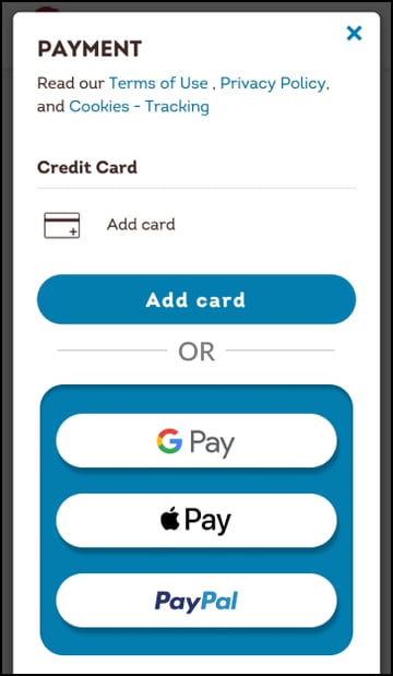
According to projections(6), the market will grow 29.1% annually over the next seven years, eventually reaching $11.83 trillion by 2028. Limiting users’ payment options, Burger King creates an opportunity for other services that users may find quicker and easier to use.
By removing these remaining obstacles from the users’ ordering journey, Burger King will speed up the checkout process and create a more seamless experience. Creating a positive ordering experience(7) will give users a strong impression long after leaving the site.
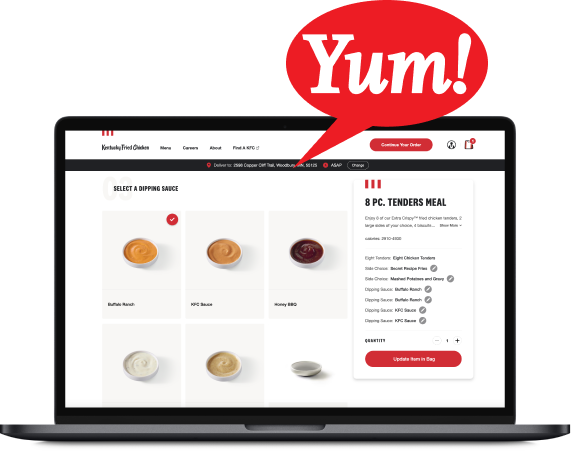
🥳 Usability Success: Customization
Burger King has one excellent example of successful usability: its product customization.
By keeping the interface simple and consistent, users can process orders quickly with less confusion. This site makes complex choices straightforward by utilizing the UX Principal of Visual Hierarchy(8), labeling and grouping complex options for the user.
This area of the Burger Kings site is an excellent example of how UX design and visual-design principles(9) can improve customer satisfaction for a fast food eCommerce site.
In this video, a user quickly selects options for their order.
🤔 Usability Issue Example: Forced Options
On Chipotle's site, when a user selects a product, they must pick all available options or select the no option for each section. Users must scroll through a long list of possible choices. Not having default options pre-populated will slow the ordering process and lower conversions.
Conclusion
We discussed three ways that Burger King could improve its site:
- Improve the placement of the “Share Location” button at the bottom of the page, which is hidden on smaller screens.
- Remove the process requiring the user to Sign In before purchasing.
- Accept forms of digital payments that are easy to use: Apple Pay, Google Pay, etc.
From our experience implementing comparable changes, we believe conversions would go up 4% just by making the three suggested changes. Bitovi has doubled conversions for similar retail clients by making comprehensive, research-backed product design improvements.
Look out for our next post, where we will guerrilla test another fast food eCommerce restaurant website. We tackled similar problems in the previous post, Wendy’s usability issues.
If you have questions or there are other sites that you want to see us discuss, join Bitovi's Community Discord.
If you have a customer-facing site or mobile application you'd like our team to review, sign up for a free UX consultation today.
Footnotes:
-
- Lade Tawak: A beginner’s guide to guerrilla research: Oct 18, 2019. Accessed on:Sept 11, 2022: [Online]. Available: https://www.invisionapp.com/inside-design/a-beginners-guide-to-guerrilla-research/
- Unbounce.com: conversion-benchmark-reports: Accessed on Sept 11, 2022: [Online]. Available:https://unbounce.com/conversion-benchmark-report
- Law of Proximity: Accessed on Sept 11, 2022 [Online]. Available:https://lawsofux.com/en/law-of-proximity/
- Shopping Cart Abandonment Rate: Accessed on: Sept 11, 2022 [Online]. Available:https://www.geckoboard.com/best-practice/kpi-examples/shopping-cart-abandonment
- Amy Schade: Don’t Force Users to Register Before They Can Buy: July 5, 2015: Accessed on Sept 11, 2022 [Online]. Available: https://www.nngroup.com/articles/optional-registration/
- Keith Hodges: August 24 2022: 22 Mobile Payment Statistics Detailing the Industry’s Growth: Accessed on Sept 11, 2022 [Online] Available:https://moneytransfers.com/news/content/mobile-payment
- Lexie Kane: The Peak–End Rule: How Impressions Become Memories: December 30, 2018: Accessed on Sept 11, 2022 [Online]. Available: https://www.nngroup.com/articles/peak-end-rule/
- Kelley Gordon: Visual Hierarchy in UX: Definition: January 17, 2021:Accessed on Sept 11, 2022 [Online]. Available:
https://www.nngroup.com/articles/visual-hierarchy-ux-definition/ - Kelley Gordon: 5 Principles of Visual Design in UX: March 1, 2020:Accessed on July 11, 2022 [Online]. Available: https://www.nngroup.com/articles/principles-visual-design/
- Lade Tawak: A beginner’s guide to guerrilla research: Oct 18, 2019. Accessed on:Sept 11, 2022: [Online]. Available: https://www.invisionapp.com/inside-design/a-beginners-guide-to-guerrilla-research/