
In fast-paced development timelines, teams are often forced to skip critical steps in the design process. Unfortunately, user testing is one of the most commonly omitted steps. In an effort to save time in the short term, significant usability issues often arise, requiring more time to correct them in the long run.
Research consistently shows that skipping user testing can result in:
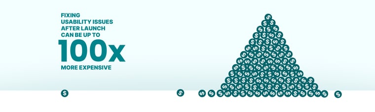
- Higher development costs: A Forrester report highlights that every dollar invested in UX results in a return of up to $100 due to improved usability and customer retention (there have been similar findings from IBM and NASA).
- Lower user satisfaction: Usability problems frustrate users, leading to reduced engagement and lower brand opinion. According to a 2020 Nielsen Norman Group study, usability testing can reduce product design errors by 62%.
The Solution: Rapid User Testing
Rapid user testing is a streamlined approach to gathering actionable feedback from real users within a condensed timeframe. Unlike traditional testing, which can take weeks or months, rapid testing focuses on quick iterations, often leveraging methods like guerrilla testing (where participants are acquired through approaching individuals in a public space) or moderated remote sessions.
This rapid user testing is effective because it aligns with Agile principles, providing continuous feedback without disrupting development timelines. It is cost-effective, requiring minimal setup and resources, and reduces risk by detecting usability issues early, preventing costly post-launch fixes. Studies from sources like Nielsen Norman Group and the Interaction Design Foundation show that even testing with just five users can uncover 85% of usability problems, highlighting the power of rapid testing to deliver actionable insights efficiently.
eCommerce Examples
After Bitovi’s work on the KFC mobile app, we wanted to see how well some other fast food mobile sites held up. To identify usability issues, we conducted rapid user testing for each project in just one day by using the mobile sites in their current state and visiting local restaurants to recruit participants.
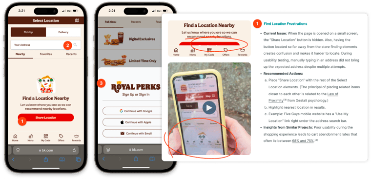
Burger King
After spending a few hours with users, we found three areas that were consistently hampering users. By observing real customers in real-world environments, we identified critical pain points, such as starting the ordering process and forced sign-in. For instance, many users struggled to find the "Share Location" button, which was buried under less relevant content. This leads to customers being unable to choose a restaurant to start their order with.
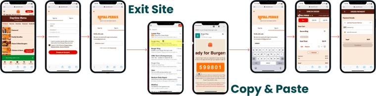
Users were then faced with a required sign-in. According to Baymard Institute, 26% of users who abandon their shopping process do so because they were required to make an account. In this instance, users were additionally required to confirm their email account by copying and pasting a code into the website. Our work on the KFC app demonstrates a much better process, allowing quick guest accounts.
Lastly, the payment options were limited to credit cards only. By ignoring easy pay options, such as Apple Pay or PayPal, the checkout process is significantly slower and will exclude some customers. Our work on the KFC app demonstrates a better process, allowing the quick creation of guest accounts using virtual pay services.
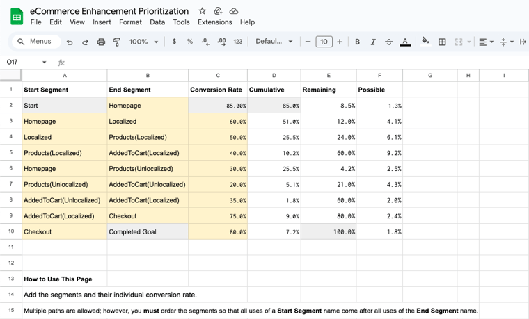
Addressing usability issues like these has increased the conversion rates of similar Bitovi clients. We even have a tool (pictured below) to help calculate potential conversion improvements.

Wendy’s
By gathering quick feedback from real users of Wendy’s mobile ordering site, we uncovered that users found themselves waiting for slow response times, slow loading between screens, and multiple animation that slowed down the ordering process. Because the Doherty Threshold states that users expect system feedback in less than 0.4 seconds these response times will lead to higher abandonment rates.
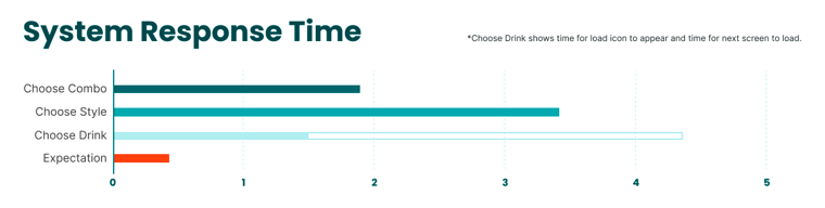
By optimizing the front-end engineering of the ordering widget to be faster, this issue will be addressed. Our test results also found users were repeatedly unwilling to sign in to see special offers. By enticing users with specific special offers, they will be more interested in doing so.
If these changes were implemented, Wendy's would see a noticeable improvement in the speed and accuracy of mobile orders and increased conversion rates.

Bitovi Can Help Increase Your eCommerce Conversion Rates
With technical and UX improvements like those we’ve highlighted here, Bitovi has a track record of significantly improving eCommerce conversions—including doubling or more the conversions for KFC, Levi’s, and Sam’s Club. We can help with a free UX consult, or dive in a bit deeper with a two-week UX health check that involves:
- Perform rapid user testing and expert analysis to identify pain points and untapped opportunities.
- Provide a detailed report with actionable recommendations.
- Plan a prioritized roadmap for success based on severity and complexity.
Whether you’re optimizing an eCommerce platform, conducting a usability audit, or delivering user-centric products under tight deadlines, our UX consultant services are designed to help you succeed.
Learn more about how our UX Health Check can transform your product development process by visiting Bitovi’s UX Health Check or contacting our UX Consulting experts. Happy testing!