Accessibility was front and center in my previous article, 3 things every product design team needs in 2023. People seem to be passionate about ensuring designs are accessible. There’s a lot of talk of it online, but how many product design teams have a designer on their team with lived disability experiences?
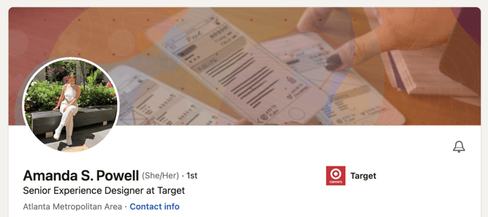
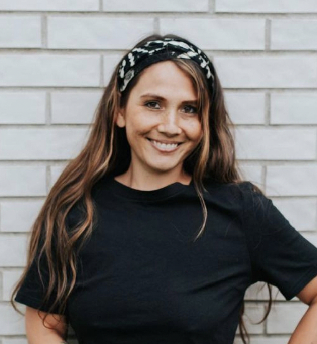
Enter Amanda S. Powell, currently a Senior Product Designer at Target and a young mother who’s experienced multiple disabilities over the years, including vision problems and autoimmune disorders. Amanda dedicates her life to inclusive design and ensuring there’s a voice for accessibility from the start of every product design project.
Introducing Amanda S. Powell

I’ve had the pleasure of knowing Amanda since hearing her Black Ignite talk in 2020. She has defied the odds on multiple occasions and built a career based on her lived experiences and thirst for change. I was curious about her consumer-focused work at Home Depot and Target. And I wanted to hear how her experiences shaped how she approaches design. What does she want industry leaders and the general public to know about living and working with disabilities? And what are common pitfalls we can easily fix when designing for everybody?
One thing I think we can do better is to remember we are all people. Disabilities do not define someone. Amanda is an interesting, quirky, smart human being just like you and me, and should be celebrated as a whole person. I loved getting to know her last Friday.
Before reading on, watch the 15-minute “Meet Amanda” video, where I ask her 23 random questions about how cool and weird she is. Part 2 will go deeper into accessibility when we invite some of our peers in for a group discussion. Until then, please enjoy this brief interview with Amanda S. Powell.
Interview with a Disabled Product Designer on Accessibility
Heatherlee: Hi Amanda, thanks for being here as my first interviewee for the Bitovi blog. Can you briefly introduce yourself to start?
Amanda: My name is Amanda Powell. I am a Senior Experience Designer at Target. I work on both Content Strategy and UX/UI. I do a lot of the content strategy for multicultural campaigns like Black Beyond Measure and Pride and work on the AMA and VR stuff for Target. I’ve been doing that for around 5 years, and I love to share my experiences around accessibility.
Being visually impaired and chronically ill is a big part of my story. I was scared to share it for a long time, and so I’m also part of the advisory board at Target for their Disability and Mental Health Business Council. It’s also why I help bring more exposure to people with disabilities here at Target, highlighting the struggles our guests go through but also how we are just like everyone else. So, you know, have us included, have us at the table.
Heatherlee: What are some key factors that tell you a product design team cares about accessibility? Do any industry examples stand out?
Amanda: Sometimes I’ll be walking around a space, and there’s such attention to detail for people who have disabilities, so when I don’t see it, it really stands out.
For example, when you’re on an elevator and you hear a voice saying every single floor number out loud. A lot of elevators don’t have it, but it’s so helpful if you’re visually impaired. Or when they space the numbers out in a different way, side to side, or there’s braille or raised numbers physically outside the buttons so you can still feel them. When I get on an elevator, and I don’t hear that voice or feel those physical numbers cues, it really stands out in my mind.
Heatherlee: I’d like to shine a light on temporary disabilities. You yourself have experienced physical impairments that were situational. What’s it like going in and out of different physical abilities, both in life and at work? Specifically, has it changed your relationship with technology?
Amanda: The biggest thing has always been my vision. Because when you’re sick, at least for me, the number one thing I always try to keep is my sense of independence. And when I couldn’t even navigate something basic like using my phone, that was incredibly challenging. I had to look up different ways to gain my independence back.
So sometimes it is frustrating when I’m using an app, and they don’t comply with my phone settings, the text doesn't automatically size up, or I’m not able to zoom in if I’m using a native website. That’s the worst. Or contrast colors are off—light backgrounds with light grey fonts. Why are you doing this to me? You hate me (that’s what I’m thinking).
I know it looks so nice with your bright screen colors, but it’s the worst. A lot of times, I’d have to screenshot things on my phone and then zoom in. Or I utilize voice-to-text (a screen reader), and that will help me interpret it. I’ve learned those shortcuts. Sometimes designers prioritize aesthetics over practicality or accessibility, but I do think people are getting better, especially in the past 5 years.
Heatherlee: It’s good that things are improving. What are some ways you stay engaged in accessibility and product design?
Amanda: Yeah, it’s great. I think a lot of people are very eager to learn more about accessibility. Before I share anything with a stakeholder, I always have it gut checked by 1 or 2 designers, and they’re the same way. We stress-test each other's designs for accessibility.
I work with the accessibility team too. I meet with one member once a month. That’s his world. He teaches me different tools and keeps me up-to-date and in touch with what’s new in the space.
Heatherlee: Is it important for you to advocate for your own unique needs at work as well?
Sometimes I do have to bring it back to me because sometimes, people don’t understand until it’s someone they can connect to. In my day-to-day meetings, I usually try not to make myself a focal point, but sometimes I do have to use myself as an example because then they have that connection, and it becomes more real. If you’re talking about a random guest, it’s harder to make that connection.
Heatherlee: You said in a previous talk about how even at work, you’d tell your coworkers that you can’t read their slides. That can be incredibly helpful, like you said, making the problem more real. It really forces people to listen, too. Speaking up at work matters!
Amanda: I use another workaround like that when I first join a campaign or team. I ask them to send me any documents prior to meeting 1. so I can zoom in on my own and not have to interrupt the meeting because I can’t read the screen, and 2. I ask them to add captions to the meeting too, so I (and everyone) can follow along. That’s becoming more common.
Heatherlee: So, being visually impaired, what features on your devices are most helpful to you?What settings should people try out on their phones to increase their awareness or maybe just to make their own experience better?
Amanda: Who wants to squint at their phones, right? When people see my phone, they always make a joke about how large my font is. But after a while, they’ll come up to me and tell me they increased their font size too, and they love it. And I always recommend reducing your whiteness! Especially if you have astigmatism. It helps my eyes, especially because I stare at my screen so much. It helps alleviate pressure. So these 3 things: increase contrast, reduce whiteness, and increase your font size.
When you put these new settings on, the way you see and experience things on your phone will look different. Try it out! What changed? What do you like about it? Designers, take note of how your designs adapt.. and how you might approach your digital content differently.
Heatherlee: And for your fellow product designers, what’s something they should definitely be doing right now?
Amanda: Implement dark mode! Some of my coworkers are surprised when I look at their designs in white, and I ask, “Can we try this in dark mode?” There are so many reasons dark mode is a thing. It really helps from a visual perspective.
Heatherlee: Agreed! Dark mode isn’t just cool. It’s purposeful. Amanda, I wish we could talk all day. This was just the tip of the iceberg, and I really look forward to part 2. We’re going to invite some of our colleagues who have various lived experiences and who are designers too! Thanks for sharing your insights. What are your final tips for Product Designers just starting out, product design teams, and our peers working to learn more about accessibility?
Amanda: When I got into UX and wanted to learn more about Accessibility, YouTube was my second university. Google is great. Every time I have a question, I look it up. If people want to take it more seriously, IAP offers a certification (hint: most jobs will pay for it). Or if you don’t want to do the certification, the prep for it is only $25, and it’s super, super thorough. I think Microsoft offers a free accessibility toolkit. There are a lot of great examples.
Lynda has some good trainings as well (which is free if you have a library card). But just honestly, YouTube your questions. There is so much out there! There’s a lot of opportunity to make the world more accessible through design. Continuous learning is key.
Conclusion
Designers like Amanda are becoming more serious about accessibility and with great reason. As people who all experience different things with our health and our abilities, whether temporary or long-term, let’s keep speaking up for ourselves and advocating for others. It goes a long way.
Product Design teams, our final advice:
-
Comply with all phone accessibility settings
-
Test, test, test! (with all types of people)
-
Implement dark mode, or else.
-
Turn on captions, even for work meetings 😄
-
Hire disabled people on your product design teams
-
Collaborate more frequently with people of all abilities
-
Follow/read literature from accessibility experts
-
Stay curious & compassionate
Watch my fun “Who is Amanda” interview and stay subscribed as we invite Amanda (and some peers) back for a discussion around diversity and inclusivity in product design, what that looks like in 2023, and the pitfalls that have been plaguing product design for decades.
Join the product design team on our Community Discord to discuss accessibility further and to bring up any topic you’re digging into. We love sharing ideas!


