Dark Patterns are used on websites, apps, and software. These patterns are intentional – designed to trick users into signing up for a subscription, making a purchase, or spamming their friends and families. There are eleven identified dark patterns; in this post, we break down and discuss how six of them work.
Intro
Have you ever bought or subscribed to something on accident because the interface was confusing? I have... maybe one too many times. I wanted to find out why companies keep creating "bad" UIs. It turns out, these user flows are designed intentionally and are called Dark Patterns and are categorized into eleven groups (and growing).
The term Dark Pattern was coined back in 2010 by Harry Brignull. According to Bringull, Dark Patterns are tricks used in websites and apps that direct the user to do things they didn't mean to, like buying, subscribing, or signing up for something. The Dark Pattern hall of shame, compiled by Bringull, is a very interesting list that calls out major brands, corporations, and people for using Dark Patterns, with specific examples shown.
These UI patterns can vary from being more benign, like LinkedIn to being malicious, like Turbo Tax. In this article, let’s take a look at six of the eleven patterns.
Bait and Switch
This twist on an old classic isn’t what you think, it’s much more deceptive. Just this past week I was on the hunt for some Nike DBreak’s. I thought I found an amazing deal, however as soon as I entered my size, 11.5 the price went up an additional $50! Disappointed with their trick, I kept shopping (I’m still looking for that good deal).
Disguised Ads
File these under sneaky as hell. As a UI designer, I often download free tools like cool design mockups. When I go to press download there are two or more download buttons… hmm, odd… ok – but I click the wrong download button. Turns out the button I hit was a well-disguised ad! Now I'm on some spammy site and miles away from the mockup I needed and need to find my way back.
Forced Continuity
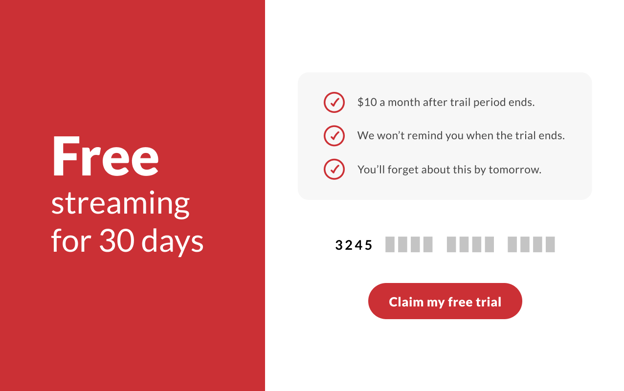
I signed up for all the free streaming trials last year. HBO, Disney Plus, Hulu, you name it. Sure I’ll remember to cancel before the 30 days is up...right? HA – does anyone remember to set a reminder? Next thing ya know you’ve spent $60 on new streaming subscriptions that you’ve only watched a handful of times.

Friend Spam
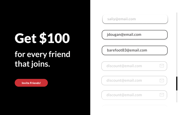
I love Airbnb, so much so that when they asked me to invite my friends to their platform for credits towards my next stay – I happily obliged. Then boom – a barrage of messages were sent out to my buddies nagging them to join at my request. Maybe I should have read the fine print, but that itself is a whole other dark pattern called Misdirection.

Hidden Cost
It’s lunchtime and I’m ordering some sushi from a popular delivery app that rhymes with goober feets. The Tuna Lover meal is listed for $15.99 which is perfect. I'm thinking that plus a tip and I’ll spend around $18 for a really tasty treat. Only when I go to place my order the total is $26.55 with a tip included. The hidden costs were labeled as “Taxes and Fees, $4.57”, “Delivery Fee $.99” and a 20% tip on top of that. Why not just auto calculate service fees and taxes automatically?
Full disclosure: I did buy that sushi and it was delicious.
Conclusion
Users are becoming savvier by the minute and expect a simple, polished UX that doesn’t manipulate them. Brands that continue to employ these patterns will lose both loyal and new customers to their competition. Not sure if you’re using dark patterns? Contact us for a free review of your product and our team of UX designers can help identify problematic areas.
If you need help removing and refining dark patterns in your application or website,