There is nothing more rewarding than watching people use your app and seeing how they interact with it. User testing is a lot like making dinner for someone; you choose a recipe, ingredients, and invest time making a meal you hope your guests will like. Then you sit down with them and talk about what is good about the meal, what could be improved, and if you’d make it again. At Bitovi, we put a lot of value on testing our designs (and our assumptions!) to be sure we’re building the right thing for our clients and our clients' customers.
Case in point: we’ve been working with HaulHound to create a next-generation app to connect truckers to shippers. Think of it like a dating app, except matching truckers who have empty trucks with shippers who need to ship their goods. While we have expertise at building interfaces, we still insist on checking our designs with real people to make sure it works for them. So when it came time to add a handful of new features, we knew we needed to validate our assumptions before taking the time to build it all out.
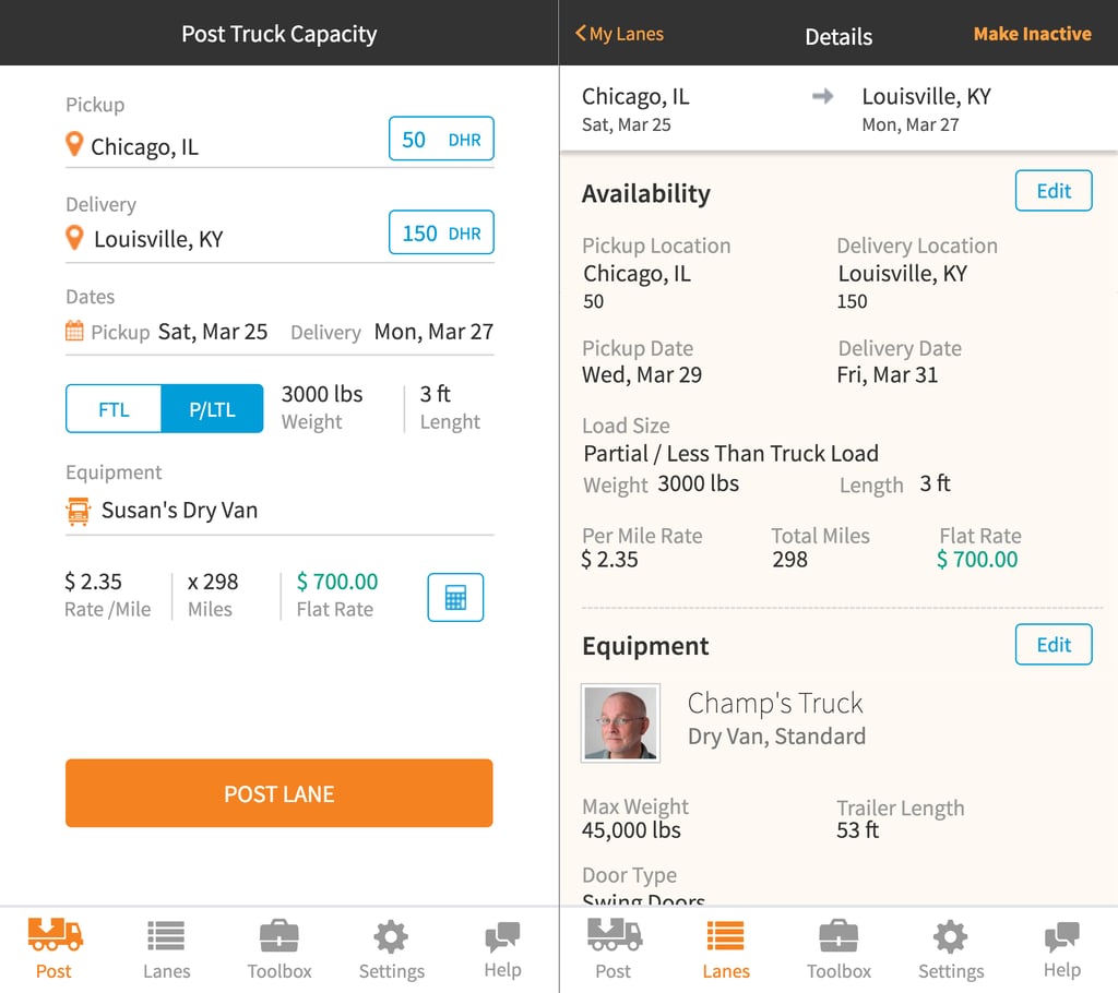 HaulHound mobile design prototype
Believe it or not, it’s actually very difficult to do user testing with HaulHound’s audience. Truckers are on the road constantly and don’t always have access to the latest tools. To add to that, we had a difficult time finding a tool that would allow us to easily record participants (and their interactions) remotely. In the end, we decided the best solution was to try out the app at an upcoming tradeshow where we knew we’d have a captive audience of people that we built this app for: The Mid-American Truck Show (MATS).
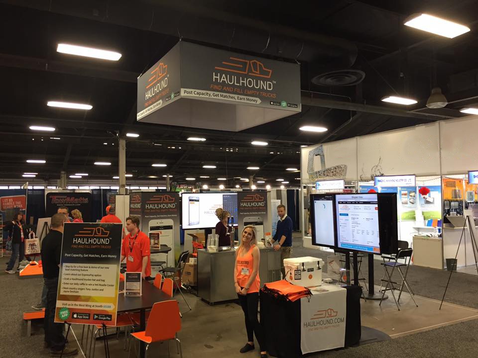 HaulHound booth at MATS
Task-based User Testing
We wanted to test a new version of the application with users to get feedback on functionality and usability. We developed two scenarios, one for mobile and one for desktop, and a series of tasks for each scenario based on posting lane(s), managing profiles, reusing past posts, and assigning users to existing posts.
Testing Setups
We did four mobile tests and four desktop tests with users who were new to HaulHound. The mobile test behaved like a functioning app and was tested on an iPhone 6S using the Axure Share app (www.axure.com). Gestures were recorded using a (super awesome) Mr. Tappy mobile testing kit (www.mrtappy.com), a HD webcam to capture hand interactions, and QuickTime to record. The desktop test was done on a MacBook Pro using a local Axure prototype. On-screen interactions were recorded using QuickTime.
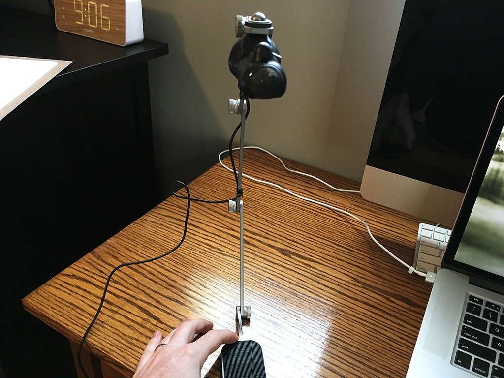 Mobile testing rig - Mr Tappy
Scenarios & Tasks
The scenarios for both the mobile and desktop tests were the same:
You are an owner-operator with a small fleet of trucks. You currently have space in your truck for one 36” x 36” x 36” crate weighing 3,000 pounds to fill in your trailer. You are currently in Chicago, IL heading to Louisville, KY. You are leaving on the 25th of March and need to make your other deliveries on March 27th.
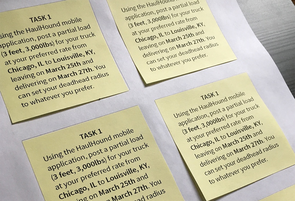 Tasks prepared on Post-It Notes
Users were asked to post lanes, add/modify user profiles, and update active and inactive lanes. They were read the scenario and given one task at a time, first read aloud, and then given a Post-It Note with the task printed on it to refer back to.
User Feedback
The feedback we received from testing was great. Error rates were low, even with only 50% of users self-reporting that they were technically proficient. All users for the mobile test completed all of the tasks.
Users found or noted errors like:
- Wanting to click on names of things to edit, not just the edit button
- Some tabs looked like settings
- Need to streamline reusing a previous post
- Questions about app terminology versus trucking terms
- Date picker should highlight a span of days
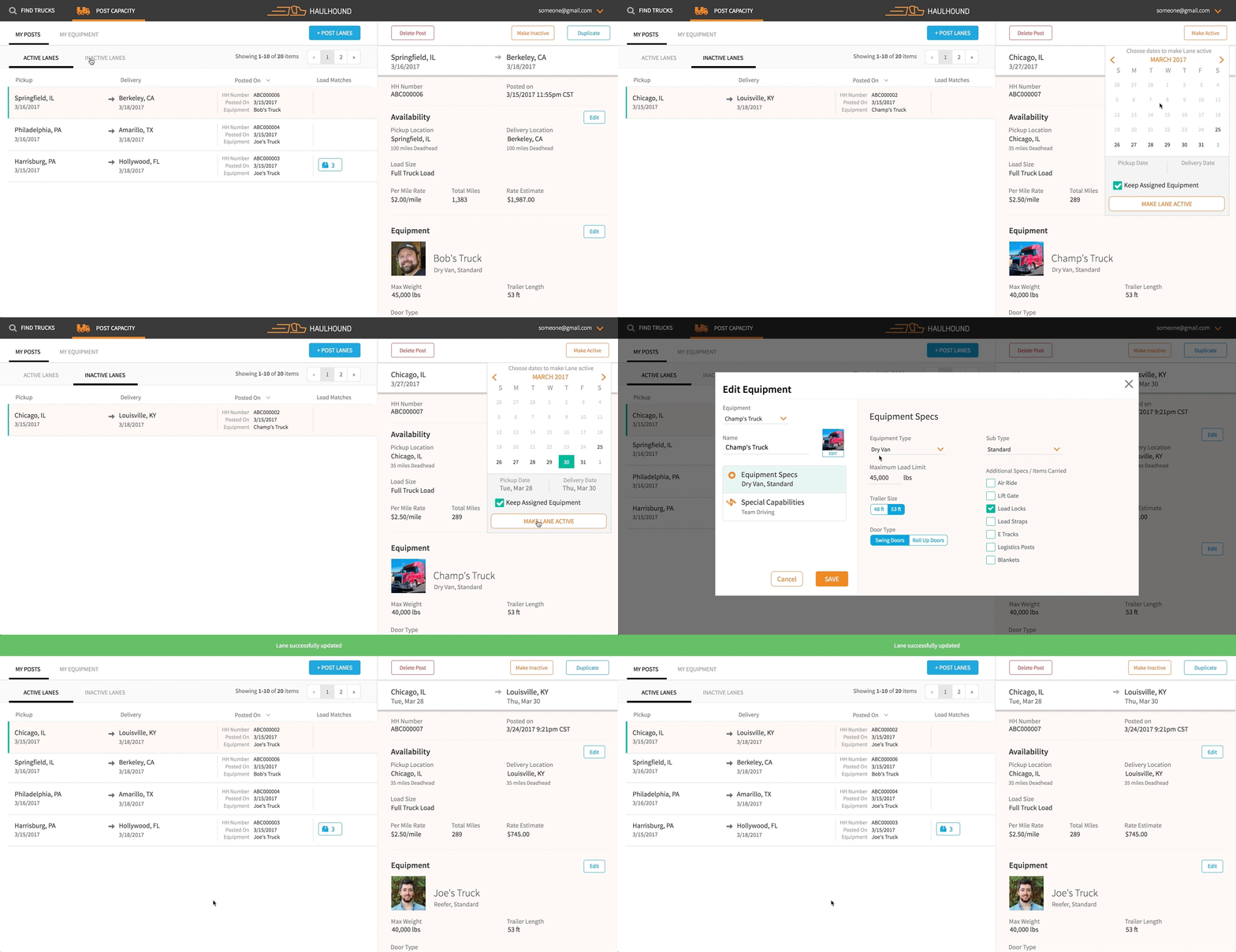 HaulHound desktop design prototype
The best part of the desktop user testing was one non-technical user. She told us she couldn’t test with us because she "didn’t do computers", carried a Nokia brick phone, did not own a tablet, and used an electric typewriter every day. In the same amount of time as the other testers she was able to complete all assigned tasks without errors. Her test was instantly rewarding for us – a non-technical user with no prior knowledge can pick up the application and use it as expected.
Users told us their stories of what is difficult about trucking and what solutions might help them out. One user told us he bases his prices on a per day rate, something we hadn’t considered until talking to him. Now we are adding that to the next version of the app. Users noted that HaulHound was “simple to use”.
Revise and Test Again
Testing an application in the wild with real users is always exciting. In eight hours time we were able to get positive feedback and capture potential errors/issues in the design. It is rewarding to interact with users and hear their stories. Users let us know that our presence at the booth was exciting and engaging, and demonstrated HaulHound’s devotion to the user. The feedback and observations collected from this test will be used to update the app and test again.
Bonus Content: For another great place to test real users, try The Coffee Shop User Experience Lab.
Previous Post


