Think of the app on your phone that you love using: the one that just makes sense when you use it, the one that feels like it was built with you in mind. This is good UX or User Experience. Good UX makes an application sticky; it invites new users and retains active users. UX is the process of designing an application (or product) that is intuitive for people to use by considering how they will use it. Intuitive interactions are important for every project simply because people like things that are ‘easy to use’. However, creating a product that is easy to use takes lot of time, expertise, and iterations.
Your Product Already Has a User Experience
Whether you realize it or not, you’ve already created a UX for your app, but that doesn’t mean that it is easy or fun to use. Every product that faces an audience should be examined by thinking about how people will interact with that product. It's always better and more cost-effective to consider your user experience from the very beginning.
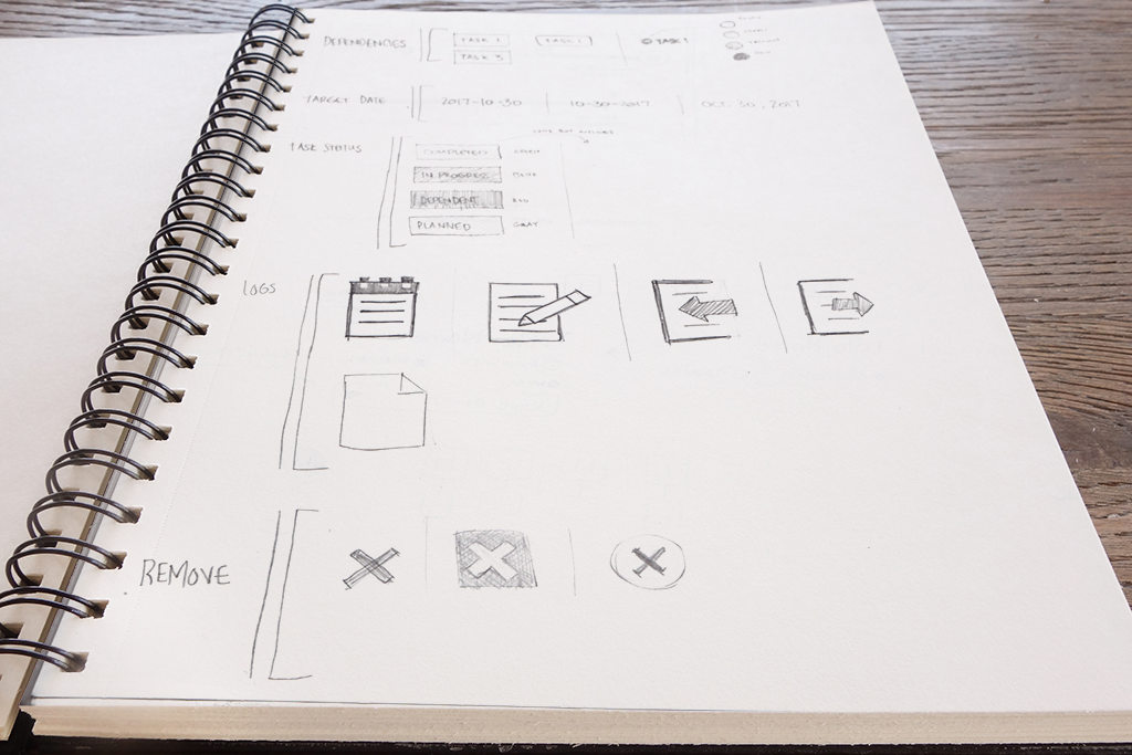 Sketching is a simple, inexpensive way to get started on the UX.
The best way to make sure your product is easy to use is to talk to the people who will use it. For a UX Designer, this starts by listening to the product owner, identifying business needs and goals, and empathizing with the user to uncover their pain points.
This process starts in the initial project meeting:
- Noting desired project outcomes
- Understanding business requirements
- Defining the primary audience
- Identifying a secondary audience
- Researching competitors
Defining the Experience
A UX designer will begin to translate these needs into possible (designed) solutions. This begins with sketches and flowcharts of how a user gets from start to end points. Common interaction questions include:
- Is this a new idea or is there a process already in place?
- How can it be done?
- How does the user complete the task with few interactions as possible?
- What are possible pain points?
- What works? What doesn’t?
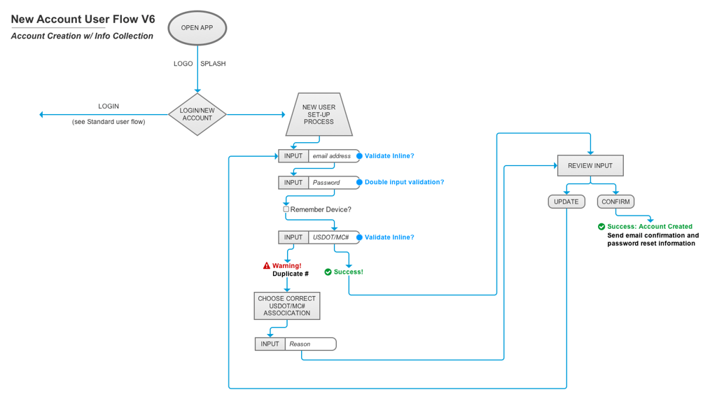 User flows help communicate to the client and the team how the application will work.
At this point in the process, everything is a good idea until it is examined. We start by generating lots and lots of ideas and solutions. This is called “ideation”. These visualizations help the designer to refine or ‘iterate’ on ideas that work and quickly discard concepts that do not.
Also, in the initial project meeting we can start to define the scope of the project, or how much can be done in the time allowed. This gives us a list of project requirements to discuss and gives direction for working toward the project outcomes.
Understanding the User
The next step is to define the user. Understanding the user will help to refine project requirements, initial design concepts, and user flows. UX professionals document this process to share with the client so there is clarity on why design decisions were made. This conversation is established from the beginning of the project to create and foster trust between the design team and the client. These discussions establish a common language including:
- Client/project terminology and vocabulary
- Personas, or user stand-ins, created based on researching the intended user giving basic background information and the users needs when using the application
- Scenarios defining where and how the user is interacting with this application
- User stories about how the user will get from the beginning to the end of a task outlining each step along the way
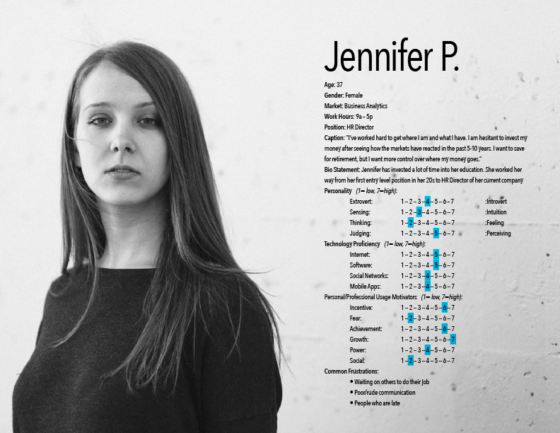 Personas act as stand-ins for your users and a guidepost for keeping them at the center of decision making
Visual Outcome
We want your project to be both beautiful and usable. Based on the project requirements and research, the designer will create user flows, user stories, and design the User Interface (UI). This allows us to refine and resolve the project before anything has been built and continues through the process of building the application.
The design process starts on paper or as digital wireframes. This is called ‘low fidelity design’ and looks rough and unfinished. The idea is to get to testable, or reviewable concepts quickly get feedback and refine/fix any notable problems. We are testing how users respond to the layout, how they interact, and how they get from one task to another. As the process moves forward, the design becomes more refined and incorporates more detail – color, type, visuals, etc. – becoming a ‘high-fidelity design’, or something that is more polished and beautiful, just like what we expect from the final project.
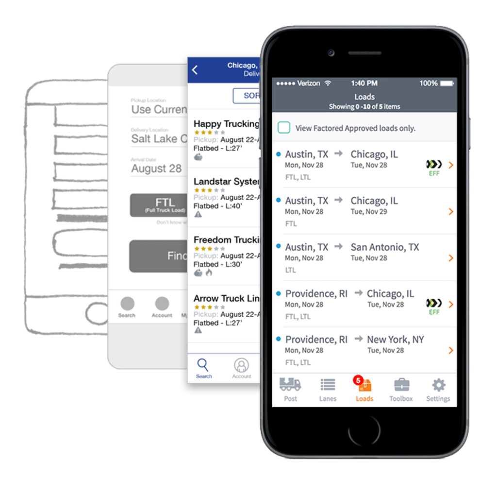 Iterating your design helps to discover ways to improve the project before development
Interactive Outcome
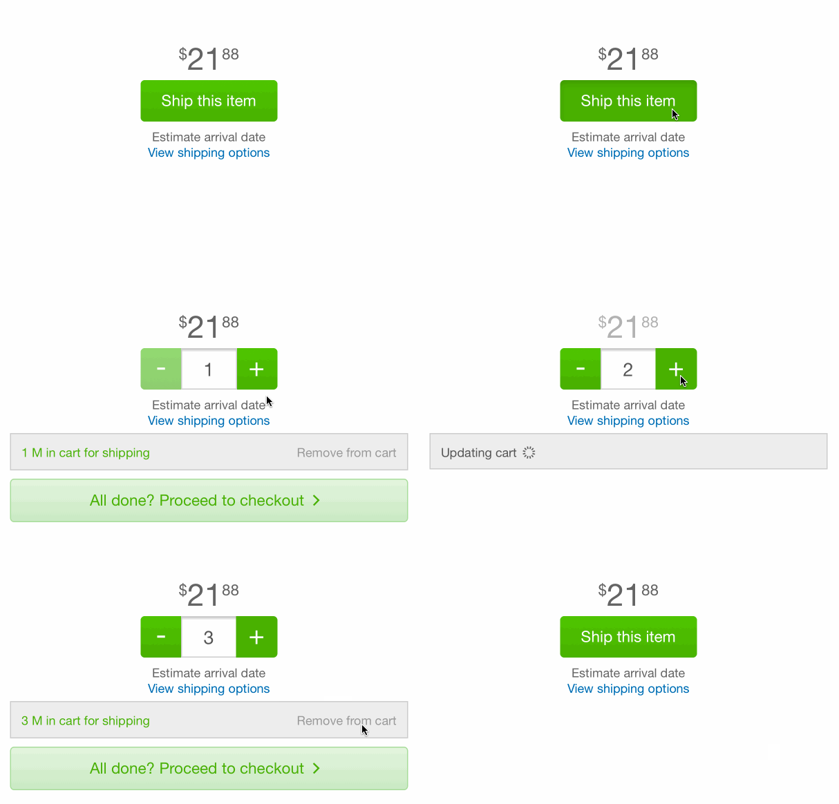
Next, we create prototypes, or usable demonstrations of interactions. Usually, prototypes have limited interaction (low-fidelity prototypes) and follow a script. Fully interactive prototypes (high-fidelity) are possible, but they take a lot of time to build. Low-fidelity prototypes are better to test with because they take less time to create and can be put in front of a user faster to get feedback. These demos are beneficial for two reason:
- They give the designer, development team, and client an example of how the interaction will work, allowing for refining the interactions
- More importantly the demos allow the UX Designer to sit down with real, live, actual users and start to ask their feedback
Task-Based User Testing
We get excited when we get to interact with real users to get feedback on what we’ve been building. Because of this, user testing is built into the UX design process. With a prototype in hand, we can sit down with users and get feedback on functionality, layout, process, and aesthetic design.
We ask the user to imagine a situation in which they might use the product and then give them a task to complete using the prototype. Then we observe how they use it and ask questions when they do something we think is unexpected. User testing gives a voice to the user; they can tell us what works, what doesn’t, and what they expected and why. It's best to record the user test on video and take notes that you can review later. We test with multiple users to get more feedback, and afterwards analyze their feedback, calculate errors, and make suggestions to refine the application based on the average user.
After testing is complete, the UX Designer will review the notes and video in order to make suggestions for improvements based on purpose (from usability.gov):
- Ease of learning
- Efficiency of use
- Memorability
- Error frequency and severity
- Subjective satisfaction
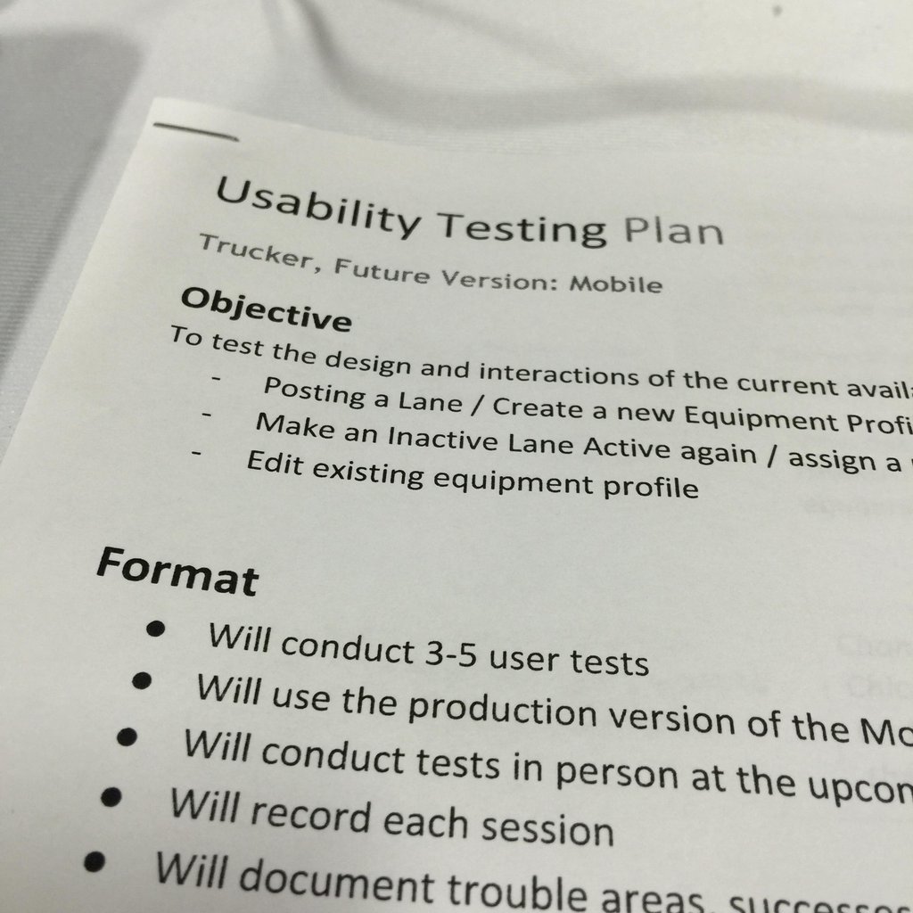 Develop a plan when conducting your usability testing
Errors/issues/incomplete tasks are also reviewed:
- List the errors
- Conclude why they were made
- Rate the severity of each error
- Correct for the most severe first, and then work down the line – (Nielsen Norman Group severity scale)
Using this information, we will redesign the UI and/or interactions to remove errors and then test again. This is commonly know as “Fail fast, fail often”. The more interaction done with users, the more likely we will create an application that is “easy to use”.
Design and Repeat
And then we do it all over again! Through each step of the process we continue to refine the app by solving problems, releasing a new version, and improving it each time. The end result is an app that solves business problems, is easy to use, and looks great.
UX Makes Good Business Sense
Having a well-formed UX process allows both the designer and the client to better understand who the project is being created for and then build something that meets those needs. When you consider how your audience will interact with your app, you’ll be more likely to create something successful and have a lower total cost of ownership in the long run. Not sure? Read about how having a UX designer can save you both time and money.
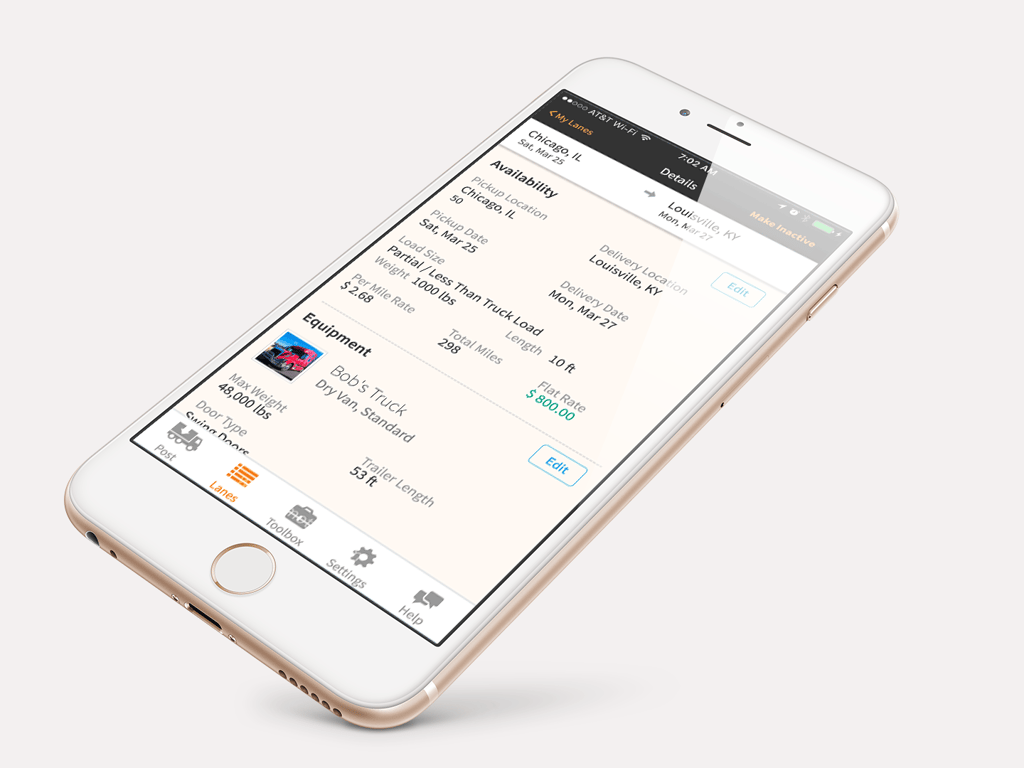 Build a well-designed, thoughtful application that was tested with your intended audience
Previous Post
Next Post
