The goal of every UX team should be to solve business problems with thoughtful design solutions. In fact, I’d say it’s not difficult to find a designer or agency who can create great-looking designs. Beautiful and useful design is a given in our industry. At Bitovi, we do those things too - but I want to know what makes our design team different. I want to help people understand why are we uniquely qualified to work with our clients.
The process of identifying our values involved looking at our projects, noting what we did well every single time, and highlighting those core strengths. I had to include our company’s hard-core nerd engineering-focus and distill that with our talent and expertise in UX and interface design. I found myself asking questions like:
- What do we do on every project, almost automatically?
- What stuff are we so good at that we can do it quickly without even thinking?
- What do we talk about a lot? Where are our passions on each project?
- What things do we NOT do very much (and we’re ok with that)?
The result was an introspective journey of defining our design team values. In this article, I'll talk about what those values are and why they're so useful to our clients. 
- Communicating Design Thinking
- Creating Documentation
- Providing Highly-Technical Solutions
- Moving Quickly
Our Values Make Us Different
The problems I see on design teams are more about workflow, communication, and efficiency than raw design skill. There’s a breakdown between designers and developers. Business requirements and design standards aren’t documented well enough. Mockups and wireframes don’t communicate interactions. All this leads to more meetings, misunderstandings, poorly implemented apps, and (often) a lot of re-work.
I realized that, for us, design is more than only creating beautiful, useful products for our clients. We’re skilled enough to not only make our clients look good, but to actually make them successful. We bridge the gap between design and development to make sure that everything runs efficiently and is delivered as-promised. These are our values.
1. Communicating Design Thinking
One of the key missing ingredients from many teams is the ability to talk about design with other people in a way that makes sense. Not only is our team really great at it, but I wrote a book called Articulating Design Decisions in an effort to demonstrate why this is so important. This value is one that allows our clients to trust us with difficult decisions and keeps everyone moving in the same direction.
Our designers are expected to own their projects and to work well with clients, product owners, and developers. We pride ourselves on communicating to stakeholders in ways that will help them see the value in our work and understand the right choices to make. It’s not enough to just hand over our designs. We work with our clients to articulate the value of the designs and maintain the integrity of the user experience. We provide product leadership and design thinking. More than that, we become fully integrated with the engineering teams to ensure that nothing gets lost in translation. From start to finish, our designers are the advocates and champions of good design to everyone on the team.
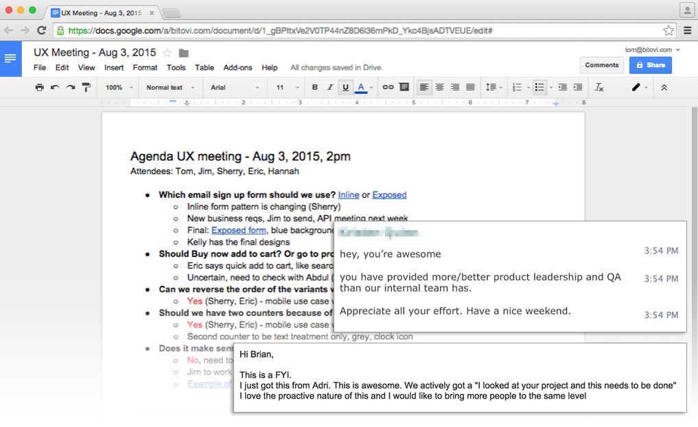
Our focus on clearly communicating design decisions results in our clients sending us happy messages like these.
2. Creating Documentation
It may seem boring, but we have found that creating clear design documentation has not only helped our clients build better apps faster, but it has also made our projects more successful because everyone knows where to find what they need. Whether it’s a paper trail of design decisions or the description of a UI widget, creating docs is something that we always do.
At the beginning of a project, our documentation is incorporated into our wireframes and prototypes. But as the app starts to take shape in the browser, our design team also actively adds style documentation inline with the CSS to create a set of guides that can outline everything from the use of color and branding, to the technical details of the API. Our clients get a live-style guide that lives with, and is updated alongside the application. One place for everything about the app. This is what we call Style Guide Driven Development and we've found it to be incredibly powerful.
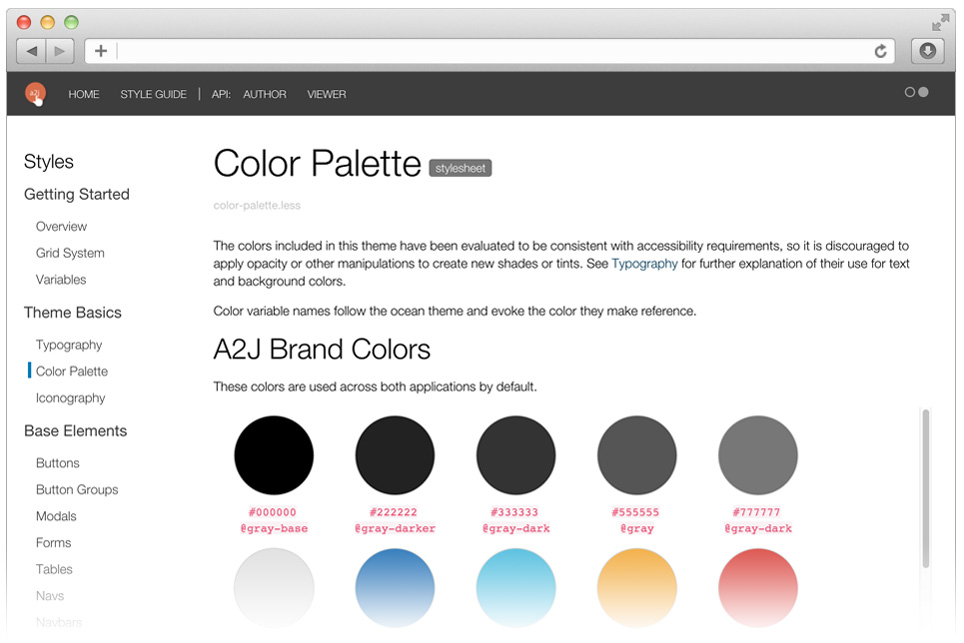
Creating a live style guide makes it a lot easier to build and maintain apps, like this one built with DocumentCSS.
3. Providing Highly-Technical Solutions
Designers can (and should!) code. We have high expectations that our whole team is perfectly capable of writing advanced CSS using Less or Sass and isn’t afraid of the command line. The value here is that we want the people who are dreaming up the interface to be the same people who are implementing it in the browser. There are huge efficiencies to this, the least of which is saving a designer the time of explaining to a dev, “No, the padding on that should be 3px more.” over and over. More than that, our artists are using the same tools as our devs. We all understand the possibilities and limitations of our tools and that makes us better designers.
Even more, we have high expectations that our designers are familiar enough with the technology stack to make intelligent decisions and work directly in the project code. This is not about unicorns. It’s about artists who are skilled enough at using the right tools to express their work. That means that all our designers run their projects locally using command-line interfaces, package managers, and servers. We submit pull requests to the project’s repository, do our own QA, and organize our CSS efficiently. Likewise, our developers are well-versed in design and adept at identifying UX concerns. This marriage of development and design is an area where we really shine.
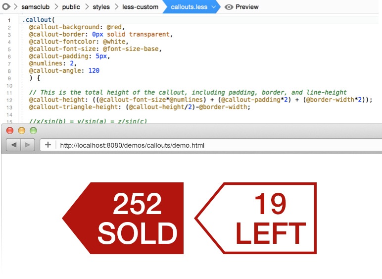
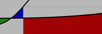
Writing the code that creates the UI is a design task, like this callout widget I made using trigonometry. Take that, Mr. Engles from 11th grade!
4. Moving Quickly
Perhaps derived from our scrappy work-from-home roots, we value making decisions and moving on. We don’t sit around trying to contemplate ten possible solutions to every problem. We go for the obvious, implement it, try it, change it, and move on to the next thing. This involves rapid prototyping with Axure, as well as short, small user tests. But the core value here is just making things happen. To do something, even if it’s wrong. This attitude and value has served us well on client projects where shipping is the most important thing.
- We often we meet with our clients daily to review the next iteration
- We see our mistakes earlier - and when we do, we fix them before development starts
- We test it either with informal guerrilla user tests or a more formal, scheduled process
When it comes down to it, we just want to sit down and get to work - and we love what we do.
Let's Do This
Bitovi’s design team is well-equipped to take on the challenges that our client projects demand. We know who we are, we know what we’re good at, and we understand our priorities. This sort of self-reflection has allowed us to build an effective team using our people, our strengths, and our values to set the tone and pace of our work.
I am proud of the work we do and I love exceeding our client’s expectations. We help them be better by modeling an efficient design process. In the end, we know that our high expectations for designers have paid off and served us well in creating best-in-class applications for our clients and for the future of the web.

.png)
