


.svg)


.png)
People have been studying design for ages, but we rarely see much crossover in the design fields (e.g., graphic design, web/app design, interior design, industrial design, advertising, film). However, Web designers can learn a lot from other design approaches to create better, more inclusive experiences, and a strong foundation for lasting products.
The most prominent example comes from a team of non-web designers at North Carolina State University, who laid down some truly universal concepts for good design. They called this series of concepts the 7 Principles of

The Origins
The term "Universal Design" was coined by Ronald Mace and a team of architects, product designers, and engineers in the ’90s. However, the principles were originally created for architecture and appliances, not Web sites.
According to NC State, Mace spent much of his career at North Carolina State University, working toward the idea of designing “all products and the built environment to be aesthetic and usable to the greatest extent possible by everyone, regardless of their age, ability, or status in life.”
Are these values not the same values we have (or should have) in tech design? Let’s breakdown these principles and you’ll see how this architecture business extends to the digital realm:
1. Equitable Use
“The design is useful and marketable to people with diverse abilities.”

As the name implies, the first principle is simply about providing an equal way for your users to access features and information. Avoid segregating any group of people because of personal restrictions and/or device capabilities. To learn more about accessibility lawsuits, discrimination, and inclusive design, read How to be an A11y - Accessibility Design.
For example:
- High Contrast: Having high contrast helps both users with impaired vision and those in an environment with direct sunlight.
- Text Equivalents (aka. Alt text): Assistive technologies (e.g., screen readers, screen magnifiers, text to speech, voice interfaces) rely on alt text, but text equivalents also help users on slow or unstable connections and act as a fallback if the image path is broken.
- Mouse-Only Interactions: Hiding information behind a mouse-only interaction (like hover or double-click) makes it impossible to access for many users. The majority of Web traffic comes from devices without pointers (i.e., smartphones, tablets), which change the interaction ‘abilities’ of your users regardless of their personal physical state.
2. Flexibility in Use
“The design accommodates a wide range of individual preferences and abilities.”

This is largely about giving users a choice on how and when they access features, rather than forcing them into places they don’t want to be. Have enough flexibility in your solutions for user adaptations and they will have a more pleasant experience. Everyone enjoys a touch of personal customization.
For example:
- Scroll Hijacking (aka. Scrolljacking): When you take control of ‘how’ a user naturally expects to scroll up/down a page, they may not have time to take everything in. This can get frustrating, causing them to leave.
- Text Resizing: Allow for the sizing up and down of text in your layouts. A simple browser or OS text adjustment shouldn’t ruin your beautifully crafted application.
3. Simple and Intuitive Use
“Use of the design is easy to understand, regardless of the user's experience, knowledge, language skills, or current concentration level.”

Every tech designer has heard their client say they want an easy to use application. Good design is often defined as being intuitive to the user and the simpler the design is, the more likely users are to achieve their goals. Unfortunately, this is easier said than done.
There are loads of blog posts about making designs more intuitive. I recommend Jared Spool’s great article What Makes A Design Seem ‘Intuitive’? and Heidi Pungartnik’s article 15 Timeless Rules for Creating Intuitive Web Apps (With Examples) to get started.
In a nutshell, before you can design something “intuitive”, you have to figure out what your users know, expect, and do, in order for the interface to correctly anticipate and respond to their actions in a way that feels natural, logical, and pleasant. Thankfully, you will not be the first person to ever do this. Many designers have come before and crafted helpful rules, patterns, and guidelines you can reference, adapt, and reuse.
4. Perceptible Information
“The design communicates necessary information effectively to the user, regardless of ambient conditions or the user's sensory abilities.”

This principle is tightly coupled with the first principle, Equitable Use. Web sites are, by and large, fancy ways of conveying information. Make your content as easy to digest as possible.
For example:
- Information Organization: Besides having adequate text contrast and sizing, breaking your information down into bite-sized pieces will make your content more accessible. Specifically, things like using subheadings in a long text post will make speed reading and skimming more effective.
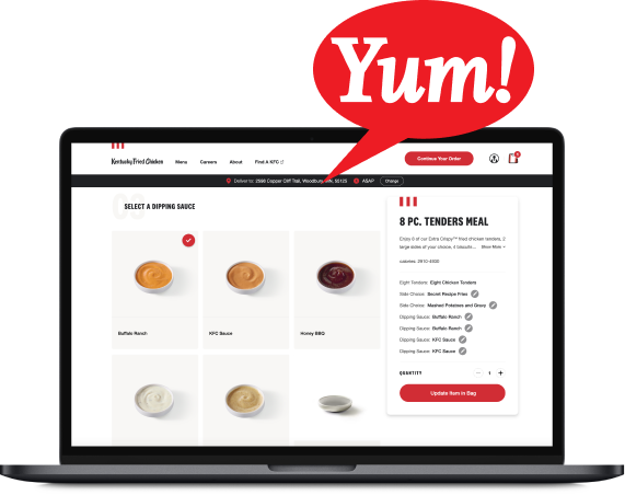
- Graphics: A graphic to emphasize a point you’re making in text helps more visual users (and can convince a skimmer to slow down and read more closely).
- Charts and Graphs: Supplying both graph and table views of data allows users not only the flexibility to choose how to get information (#2 Flexibility in Use), but can also help make patterns in the data more discernible.
5. Tolerance for Error
“The design minimizes hazards and the adverse consequences of accidental or unintended actions.”

Everyone has accidentally clicked or tapped a part of their screen or changed their mind mid-action. Ensuring that a user can’t trap themselves in a corner or accidentally cause irreversible damage to their information is paramount to keep users around. Users who are afraid of making a mistake will be less likely to use the product.
For example:
- Avoid Accidents: Account for these inevitabilities by putting permanent functions inside menus and/or behind “are you sure?” confirmation prompts. This makes them harder (practically impossible) to accidentally execute.
- Allow for Undo: An alternative to prompting users all the time is to give them an “undo” option, or a way to dig into archives to retrieve old items.
6. Low Physical Effort
“The design can be used efficiently and comfortably and with a minimum of fatigue.”

There are two aspects to this principle. The first is very literal: don’t require your users to go back and forth across the screen to complete a single workflow. The second aspect is more about mental fatigue and perceived difficulty of the task at hand..
For example:
- Action Grouping: Group actions together in specific areas of the screen. This minimizes the amount of mouse dragging or thumb stretching needed, which is helpful for anyone. It is especially helpful for users with either very large screens, or for users who have super-zoomed into their operating system and have to scroll through interfaces that would normally fit on a “default” screen.
- Minimize Requests: Don’t require users to fill out lengthy forms or jump through multiple ‘hoops’ to gain access to their goal (e.g., account creation, a trial period of your application, a sample of a new book etc.). The less effort you require, the more involvement you’ll get.
7. Size and Space for Approach and Use
“Appropriate size and space is provided for approach, reach, manipulation, and use regardless of user's body size, posture, or mobility.”

This ties into the 6th concept of having low physical effort by keeping your actions grouped together. How you use screen real estate is important to the overall experience inside the application.
For example:
- Action Targets: Take into account varying hand size and dexterity, especially for one-handed mobile device use. Make action targets large enough to click or tap easily, and put your primary actions within easy reach.
- Posture: Some users are walking down the street, laying in bed, or doing other things that may make their reach a challenge. We can’t assume all users are sitting in a chair, at a desk, with a keyboard and mouse.
- Dynamic Spaces: Virtual keyboards (and other accessibility tools) cover part of the screen. Keep dynamic space usage in mind through all states of onscreen keyboards, dropdown menus, etc. to avoid causing the user to block their own work.
Onward
These fundamentals of equity, flexibility, simplicity, perceptibility, error tolerance, low effort, and appropriate sizing should stick with you throughout your design process. Whether you’re designing Web sites or buildings, these universal design principles will help us create better experiences for everyone.
We should all be taking these concepts and using them to the advantage of our projects and our users. Let's look to other fields for inspiration, and seek out the solutions other designs have discovered, to enable well-grounded design.
Other Resources
If you’d like more information, the Centre for Excellence in Universal Design is a great website with more history, specific case studies, and even an awards system. I highly recommend checking it out.
You might also like our article, How to be an A11y - Accessibility Design.
As always, if you are looking for user experience expertise, we would love to help you out! Contact us today to discuss your project!