The most difficult part of any design process can be finding the correct, best, or most successful idea out of all possible ideas out there. In User Experience (UX) we start by finding empathy with the user, researching user preferences, successes and failures, and understanding the needs of the clients. However, even armed with research and understanding, discovering or uncovering the correct solution out of all the possible solutions out in the world can still be problematic. Used appropriately, sketching is a fantastic way to generate new ideas without the usual constraints we put on ourselves with technology.
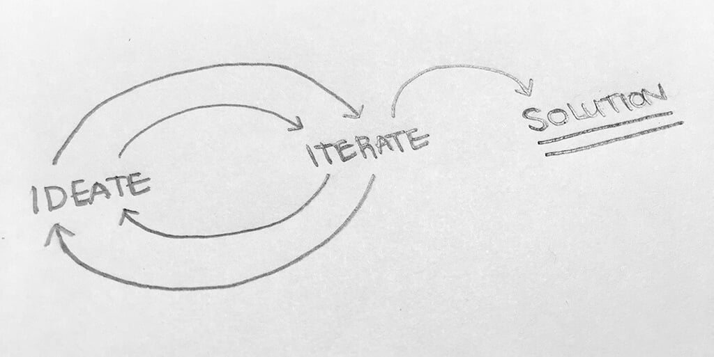 Sketching is a simple, inexpensive way to find solutions and weed-out errors.
Sketching, using paper and pencil or tablet and stylus, helps to get as many ideas out in front of you as quickly as possible. In the creative process we talk about "fail fast, fail often", the concept that quickly iterating through ideas and finding mistakes to refine and make a better project. Sketching give us a chance to quickly visualize our ideas, throw out the losers, Frankenstein together the mediocre concepts, and circle/star/make emphatic exclamation points around the winners.
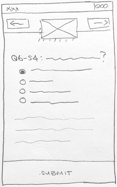 Sketching uses simple, gestural assets to visually convey concepts.
"But I’m not good at drawing"
Everyone has their own process when ideating and iterating, so do whatever is most effective for you. However, let’s talk about why you don’t like sketching first. When I used to teach in higher education, many of my graphic design, UX, and interactive students would tell me they don’t like sketching because they can’t draw. Good news, sketching isn’t anatomic drawing like Leonardo da Vinci, but more like Pictionary; simple, gestural lines to communicate greater meaning. Keep sketches basic and fast. Use simple forms like lines and boxes. Annotate where your concepts aren’t clear or where you need to communicate movement or interaction. And, like with anything, the more you sketch, the better you get at "drawing".
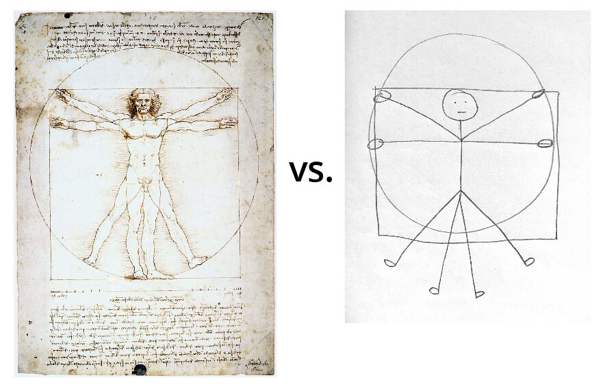 Sketching is not drawing. da Vinci image from https://tinyurl.com/zbsl223
"Sure dude, but I’m like so fast at the computer, so I’ll just do the same thing in Adobe/Axure/Sketch"
One of the common problems with going to a design program first is idea lock-in when taking the first idea to the computer. On the computer, we have a tendency to make things that use the “right” typeface, are aligned, and are pixel perfect. It is better to create simple sketch wireframes first. By generating all the ideas you can come up with allows for solving mistakes in a low-risk, inexpensive environment. In a sketch, things are expected to be messy as long as the idea is conveyed. More ideas mean more reasons to get excited about the possibilities/ah-ha moments in your sketches.
Technology is cool and appealing and we all like spending time on the computer for whatever tasks, but going to the computer first for ideation can add additional constraints that paper and pencil don’t have. For example, you can sketch anywhere with simple and readily available materials. Paper and pencil don’t have to load or run out of battery. There is an immediacy to sketching; like making lists for things you need to do, a quick sketch is a good way to communicate to your future self an idea you might forget by the time you get back to your desk.
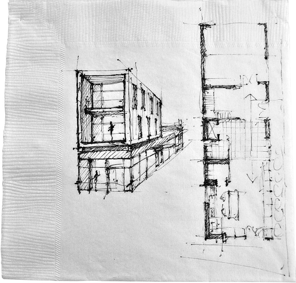 Sketches can be done with any available materials. Napkin image from https://tinyurl.com/ydx5wtp7
"But design programs have the tools I need"
The computer can be a crutch; we tend to rely on UI elements built in to Balsamiq/Sketch/Axure by default, which stifles creativity. Sketching with paper and pencil breaks out of that and makes anything possible.
- Do you want arced text? Draw a semicircle and write your text on the line
- Make a mistake? You have unlimited undos and can undo in whatever order you want using an eraser
- Need layers? Use tracing paper or scotch tape overlays
- Straight lines? Carry a lightweight ruler or use the edge of another sheet of paper. All sort of UI stencils exist for purchase, but you can also get a piece of chipboard and cut out a rectangle for uniform page, program, or website frame sizing
- Need to save a sketch? Take a picture with your phone
- Combine two ideas? Tear what you want out of the sketch and tape it into another
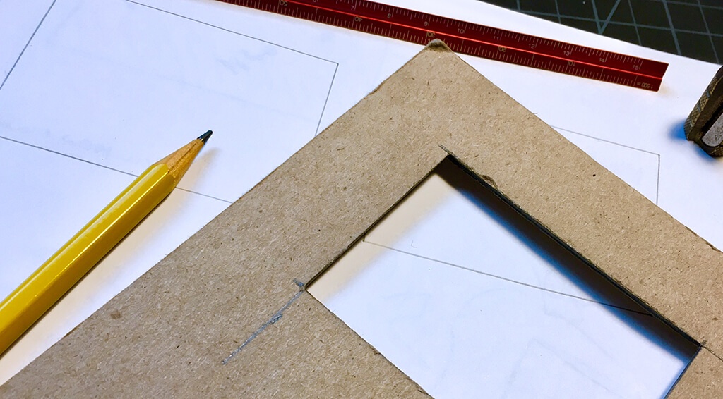 Sketching doesn't require a complex or expensive set of tools.
"Clients don’t see value in doodles"
It’s true that most clients won’t see your vision in rough paper and pencil sketches, but that’s ok because that’s not the point. (There are other ways to get buy-in.) The point is to quickly generate and refine ideas in a space that saves both time and money. If you need to present more polished work, factor in more time to take your ideas to the computer to make a clean, low fidelity example in your favorite design program.
The client doesn’t have to see how the sausage is made, but it is a good idea to get into a habit of documenting your ideation/iteration process. Save all of your sketches, feedback, and notes in one place. Process documentation adds value by showing effort, it gives us the ability to go back and show ideas that may have been tried already, keeps expectations on track, aids in knowledge transfer when onboarding new designers on to the project, and can be added to your living style guide.
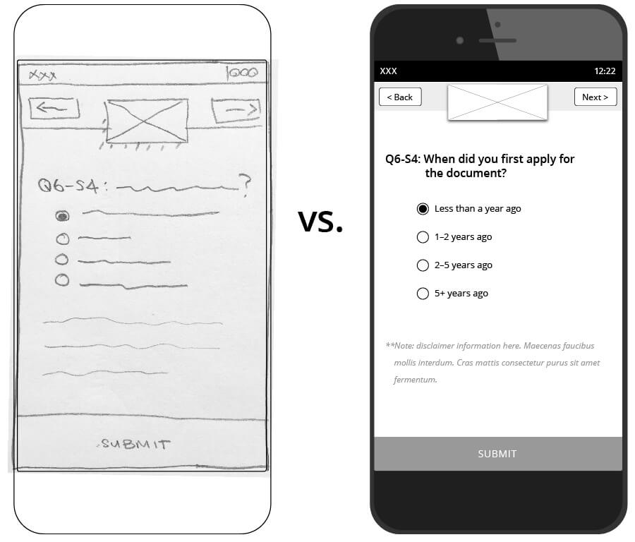 Understanding what your client sees value in can make or break your project.
Sketching for fast and effective visual communication
There is a small time and material footprint when it comes to sketching ideas in a project. Ideation can happen quickly in conversations to show rather than tell. Refining ideas on paper first saves time when moving to your favorite design program to create a pixel-perfect UI. So grab a pencil and piece of paper and start sketching!
 Start sketching! Animation by Chris Gannon
Previous Post
Next Post

.png)

