


.svg)


Creating reusable components is often hindered by excess code accounting for each use case the components need to support. For example, a dropdown that supports text, links, buttons, and even complex components, or a text component that supports multiple different types of HTML tags, in addition to reusable components as well. In both cases, a variety of props will exist for each type of component we pass in that may need to be shared between the parent and child.
Like a Pokemon Ditto, capable of transforming into various forms, what if we had a single reusable component that can shape-shift effortlessly, rendering the multitude of distinct HTML elements? In this blog post, you’ll learn how to create a versatile React component that will transform your development process.

Need 1:1 help? Talk to our React Training experts about how we can create a customized type safety training for your team!

What You’re Building
This Text component below is just that. Text is generically typed to take in any element you pass in, with any props, and it will notify you if the props do not match up with the element that is passed in.
const Text: OverridableComponent<TextProps, ElementType> = ({
  component: Component = "span",
  ...rest
}) => {
  return <Component {...rest} />;
};
Let’s start from the beginning and learn how to get there.
Creating the Component
Because this is a blog post, make a BlogComponent that accepts a variant prop and children. You only want to support span, p, and code types for now, so create TextTypes to enforce that.
Your component will look like this:
type TextTypes = "span" | "p" | "code";

const BlogComponent: FC<{
  variant: TextTypes;
  children: ReactNode;
}> = ({ variant, children }) => {
  return (
    <>
      {variant === "span" && <span>{children}</span>}
      {variant === "p" && <p>{children}</p>}
      {variant === "code" && <code>{children}</code>}
    </>
  );
};
When used, your component will look like the one below:
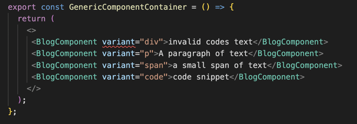
But wait! There’s an error because "div" is not part of TextTypes.
You can just rename "div" to Text so that it can be used anywhere without confusion, not just on a specific Blog page.
const Text: FC<{
  variant: TextTypes;
  children: ReactNode;
}> = ({ variant, children }) => {
  return (
    <>
      {variant === "span" && <span>{children}</span>}
      {variant === "p" && <p>{children}</p>}
      {variant === "code" && <code>{children}</code>}
    </>
  );
};
Passing Components in as Props
Wouldn’t it be great if you could pass in components as props here as well? You can! Just update the type to ElementType, which will cover both your HTML strings and custom components. Since TextTypes is only using ElementType, you can just use that type directly going forward.
ElementType will provide type safety by allowing you to specify the props and types that the components will use. You do not want to use ReactNode, as it encompasses more types than we want to support (numbers, strings, arrays, etc.) and the JSX.Element type does not provide type safety, as the props types are always set to any. You should only use that when specifically referring to a JSX.Element.
You can then change your Text component to this:
const Text: FC<{
  component: ElementType;
  children: ReactNode;
}> = ({ component: Component, children }) => {
  return <Component>{children}</Component>;
};
The variant here has been changed to component, which now makes more sense with the addition of components. So far, you’ve changed your component name to be more reusable, you’ve changed your prop name to account for any type of element you may want to pass in, and you’ve simplified how you are rendering the elements in your component.
Your Text component is beginning to look a bit more reusable with this change and will set you up nicely for generalization.
You might also notice component: Component, this is to account for the fact that components must start with a capital letter. It works great if the components you pass in will either always have the same props or no props at all; however, ElementType can be any HTML element or custom component. You must continue moving to a more general component.
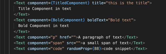
Check out these two components below with different props. TitledComponent and BoldComponent
const TitledComponent: FC<{
  title: string;
  children?: ReactNode;
}> = ({ children, title }) => {
  return (
    <>
      <h2>{title}</h2>
      <div>{children}</div>
    </>
  );
};
const BoldComponent: FC<{
boldText: string;
children?: ReactNode;
}> = ({ boldText, children }) => {
return (
<>
<b>{boldText}</b>
<div>{children}</div>
</>
);
};Defining Props With Generics
Defining all of the props that may exist in the component props is unrealistic and unmaintainable. Enter generics. Generics allow you to make components work with multiple different types, keeping them clean and maintainable, and keeping you from having to continuously modify the types they can support.
For example, each time you want to use a new component in Text, you’ll need to add the props of that component. If each component has multiple props, your Text props quickly get bloated. In addition to bloat, this will require Text to get updated each time a new type of prop needs to be supported.
const Text: FC<{
  component: ElementType;
  children: ReactNode;
  title?: string;
  boldText?: string;
  propForAThird?: number;
  propForAFourth?: number;
}> = ({ component: Component, children, ...rest }) => {
  return <Component {...rest}>{children}</Component>;
};
Start by creating a generic type for Text. Your props will need to consist of a component and some extra props, but you want them to be generic so that they can be anything you need them to be.
type OverridableComponent<TProps, TElement extends ElementType> = <
  TRoot extends ElementType = TElement
>(
  props: any
) => ReturnType<FC>;
Above, there is a new type, OverridableComponent, that accepts two type arguments, TProps and TElement. This generic function takes in any props and any component of type ElementType. You need the props to be able to be any props type for any component you pass in, so that’s your first type argument. TElement is a type argument that will allow you to use any component or HTML tag, and TRoot is a type argument that will default to TElement. This will be the root component that will be rendered. You’re not using TProps or TRoot yet, but I wanted to have it visualized.
FC has a return type of ElementType because it returns a React element.
The return type
ElementType
is constructed using the
ReturnType
utility type. The return type of a functional component is a React element, so this sets the return type of
OverridableComponent
to be a React element. Finally, you are constricting
TElement
to be any type of React element.
And then set Text to this type:
const Text: OverridableComponent<TextProps, ElementType> = ({
  component: Component = "span",
  ...rest
}) => {
  return <Component {...rest} />;
};
How cool is that? The Text component has shrunk in size and is much cleaner than before.
Because the props are set to any, you can use any component or HTML tags with any props you care to throw in, and TypeScript will not care because you’ve told it that anything is acceptable.
Implementing the Final Text Component
This ultimately defeats the purpose of having types, so that needs some work. Let’s get to work constraining your props. You’ll do this step by step and then look at the final type.
First, create a generic type for the component that can be passed into your function as a prop. For this, create a type that takes a type parameter of ElementType and sets it equal to an object with a component key. You can set the component key as optional so that you can set a default component.
type BaseComponent<TElement extends ElementType> = {
  component?: TElement;
};
Next, create a generic type, OverridableComponentProps.
You’ll be supporting many props types, and you want to be able to filter the props based on what element you end up using, so you need OverridableComponentProps to have two type parameters, TProps and TElement, and constrain those to object and ElementType, respectively.
type OverridableComponentProps<TElement extends ElementType,TProps = object>Remove Any Duplicate Props Using the Omit Utility Type.
When passing in props, there is the potential to have duplicates. The component you pass in could have props set in it, so you’ll want those props to take priority. Omit the component’s props from the props you pass in, and then add them from the component.
type OverridableComponentProps<
  TElement extends ElementType,
  TProps = object
> = Omit<TProps, keyof BaseComponent<TElement>> & BaseComponent<TElement>;
You also need to grab all of the props from the BaseComponentusing ComponentPropsWithoutRef and again omit any duplicates. This time, omit anything that exists in both your BaseComponent and the props you pass in. You want anything you send in to take priority over the BaseComponent.
First, make a generic type that combines the keys of BaseComponent and TProps
type GetPropsToOmit<
  TElement extends ElementType,
  TProps
> = keyof (BaseComponent<TElement> & TProps);
Then, omit those props from the props returned from ComponentPropsWithoutRef
Omit<ComponentPropsWithoutRef<TElement>, GetPropsToOmit<TElement, TProps>>Putting it all together looks like this:
type BaseComponent<TElement extends ElementType> = {
  component?: TElement;
};

type GetPropsToOmit<
  TElement extends ElementType,
  TProps
> = keyof (BaseComponent<TElement> & TProps);

type OverridableComponentProps<
  TElement extends ElementType,
  TProps = object
> = Omit<TProps, keyof BaseComponent<TElement>> &
  BaseComponent<TElement> &
  Omit<ComponentPropsWithoutRef<TElement>, GetPropsToOmit<TElement, TProps>>;

type OverridableComponent<TProps, TElement extends ElementType> = <
  TRoot extends ElementType = TElement
>(
  props: OverridableComponentProps<TRoot, TProps>
) => ReturnType<FC>;

const Text: OverridableComponent<TextProps, ElementType> = ({
  component: Component = "span",
  ...rest
}) => {
  return <Component {...rest} />;
};
Props is now defined as the type of OverridableComponentProps that accepts the TRoot and TProps generics.
Now you’ll get the errors that you expect:
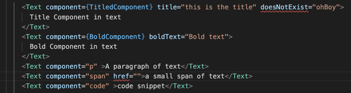
Conclusion
You now have a generic component that accepts both components and HTML tags and constrains the props passed in to avoid passing in props that do not exist in those components. Should you decide to begin passing in a new component, it will work without needing to update and modify the Text component’s allowed types. Text will stay bloat-free and clean, you will have fewer places to modify code, and unsupported props will be caught by TypeScript with the type safety you have provided with constraints! 🙌
Feel free to play around with the Code Sandbox to get a feel for It.
What do you think?
Share your thoughts about type safety in our Community Discord! Drop us a line in the #React channel to chat with our experts.
Need more help? Our React Training experts would love to create a customized type safety training for your team! Book your free consultation to get started.