A static interface works fine most of the time. But wouldn’t it be better if you added animation? You’ve seen animation used so spectacularly elsewhere. It will improve your product too. Right? Not always.
Sometimes animation can be visually overwhelming, take too long to load, or get annoying. However, when used properly, UI animation is an important asset. Let’s look at the dos and don’ts of animation.
Animation Best Practices
Less is More
Animation is fun. Including as much animation as possible can be tempting to get more of its positive effects. But animation is like salt—when you add a little salt to your food, it enhances the flavor, but if you add too much, the salty flavor is overwhelming, leaving you with an inedible dish.
If you add too much animation to an interface, you will hide your actual product and might inadvertently create something unusable.
 |
 |
|
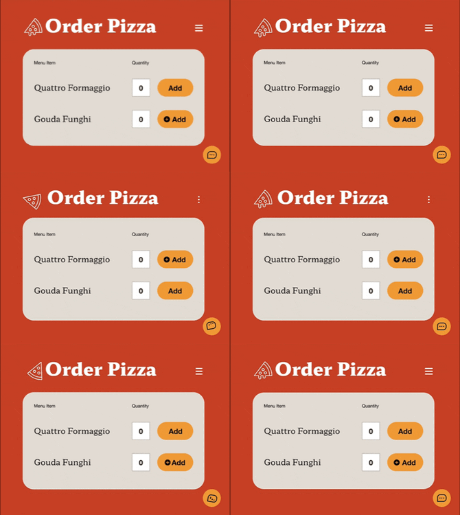
❌ A lot of fun animations. But they become far too distracting and keep the user from being able to focus on any one thing. |
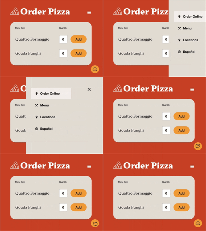
✅ By utilizing a less is more approach to animation, you can prioritize a single element to draw users’ attention. |
Time is of the Essence
Animations that take too long are frustrating. You end up waiting for the animation to finish so that you can move on to the next step. The human brain processes information faster than we sometimes give it credit. If you think your animation feels a little slow, then it almost definitely is. The sweet spot for UI animation length is between 200 milliseconds and 500 milliseconds. That means the longest your animation should be is half a second!
Subtlety is Sweet
Big, sweeping animations often feel aggressive. Instead, opt for minor effects. The goal is not to get people to notice your animations. If they do notice them, this often means you’ve failed. Animations should create an atmosphere—not be the atmosphere.
Laws of Physics
We see things moving around us in the real world every day. These objects follow the laws of physics. When we see things moving on a screen, our mind expects them to behave the same way as everything else in the world. To achieve this we must apply the laws of physics to our digital animations: gravity, force, acceleration and deceleration, an equal and opposite reaction, magnetics, and light transmission.

|

|
|
❌ Without an easing effect the sliding animation is choppy and robotic. Objects don’t just stop, they slow down. |
✅ By decelerating the movement we naturally put it in its place. Then before it swipes away it pulls back to give momentum. |
When & Where to Use Animation
One Animation at a Time
The point of animation is to make something stand out. But if everything is animated, then nothing will stand out. Even if just two things are animating simultaneously, they will both be clamoring for the user’s attention, and neither will achieve the desired effect. It’s best to stick to animating one thing at a time.
Attention Grabber
If a bird flies past your window, you turn towards it. Emergency lights flash on and off continuously to get you to notice them. Movement grabs people’s attention, and you can use that to your advantage.
If you want to ensure users see a specific part of your UI at a specific time, then animate it. If you know your users are trying to do a specific sequence of events, then guide them through it with animation. A few examples of appropriate uses are help sections such as a chat window when your user is stuck, notifications to let them know something has changed, or warnings to alert them of important information.
As a Reward
One of the most disappointing apps I’ve ever used is a workout timer app. It has both a visible and audible timer, but when you’ve achieved your goal and finished the workout the timer just resets. This is a huge missed opportunity to use a splash of animation to compliment you on your successful workout! We can reward people at multiple points throughout a user experience.
 |
They successfully created an account? Woohoo! |
|
They added an item to their cart? Great job! |
|
|
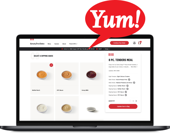
Did they complete a task? Congratulations! |
Adding animations at these points creates a bond between your user and your product. It takes the experience from successful to enjoyable.
How to Create Animations
I’m not going to attempt to give any sort of functional tutorial here. The way to execute an animation differs depending on what application you’re using. All of the applications that I will go over below have their own free video tutorials, paid instructional courses, and large communities with forums.
Applications
The application you want to use depends on where your animation is happening, what type of style you’re going for, and what technology is being used to develop it.
User Interface
Some of the same applications that are used for wireframing, designing, and prototyping can also be used for animation. Figma and Adobe XD both have animation tools right alongside their prototyping. Plugins like Anima can add even more functionality and make the transition to code much smoother too.
Vector
Creating vector-based animations has huge benefits. They are scalable, which means you can change them to be as big or as small as you want and they will always look clean. They are also able to be converted to code when done properly. Adobe Animate converts to HTML5 and the Lottie plugin converts to JSON.
Other
If you’re looking to add a little fire to your animations (literally) Adobe After Effects is a powerful video effects application and when you include plugins the possibilities are seemingly endless.
It is becoming more and more popular to see 3D animations used across the internet these days; if that’s what you’re aiming for then Blender is the best place to start.
When you’re looking for a retro style like pixel art it’s best to use a specialized tool like Aseprite to draw and animate sprite sheets.
Developer-Friendly Animation
When creating animations for UI it is always important to consider how they will be implemented. Make sure you have a plan for getting your animations from your computer to the user interface. If you’re working with a developer, discuss this early on.
File Types and Size Considerations
Bloated Files
It is important to avoid oversized files in any scenario. This is particularly important for animation because these types of files can easily have huge file weights. When an animation file is too large it can cause a roadblock in the user experience. It can force the user to wait before continuing, it can create a “pop-in” where the animation will show up later than everything else on the page, it can become out of sync with other objects of the UI that it is meant to be timed with, or it may just never show up at all.
File Types
A major aspect of the size of your file is the format that you use. Each format has its own strengths and weaknesses. Your best option will depend on your specific use case.
Animated GIFs
This file format was created in 1987 and therefore has a wide range of support across all systems. It has autoplay functionality built in and the file can be set to loop or to play only a specific number of times. It can, however, be bulky, only supports 256 colors, and the quality drops quickly during compression. It also has a boolean alpha channel, meaning the transparency can only be on or off. This creates an undesirable look of jagged outlines around any assets with curved edges. But your animation can easily be implemented into the development environment with this file type.
Video Files
There are a lot of different video file types. Because UI animations don’t typically utilize video files, aside from the content itself, we will not spend time going over those. In short, the best video file format to use for the web is MP4. Of the animation file types we’re discussing, video files are the only ones that support audio as well. But because video files have to exist in a player, it can be difficult to implement them as a UI element.
Sprite Sheets
A sprite sheet is a sequence of still images organized into one image file on a grid. The code is written to crop the image and display one specific part of it at a time in fast succession. This creates an animation. An advantage of this solution is that you can have the user’s inputs specify which part of the image or image sequence to show. Because of that, this file format has been used in video game development since 1974. In essence, you can make the user interface respond to the user. You can use either a JPG or a PNG for this and PNG files support variable transparency, which creates clean edges. Lastly, the more colors your animation has the better compression this solution will have over a GIF file.
Lottie Files
The newest solution is a JSON-based animation file. Because it is built with code it has the smallest file size and is easy to implement. While it is not supported everywhere, it is open-source and adoption is spreading quickly. It must also be a vector animation, lucky for us this is typically what UI animations are, but it is worth pointing out that Lotties do not support raster-based animations or video recordings.

|
|
Vector-based w/ 12 colorsFile Sizes
|
Video-based w/ thousands of colorsFile Sizes
|
Conclusion
Animation is a powerful tool that can definitely improve your product. But it can also be harmful to your product if you don’t follow best practices. If you need more help implementing animation into your experience reach out to our Product Design Team for a free consultation!


